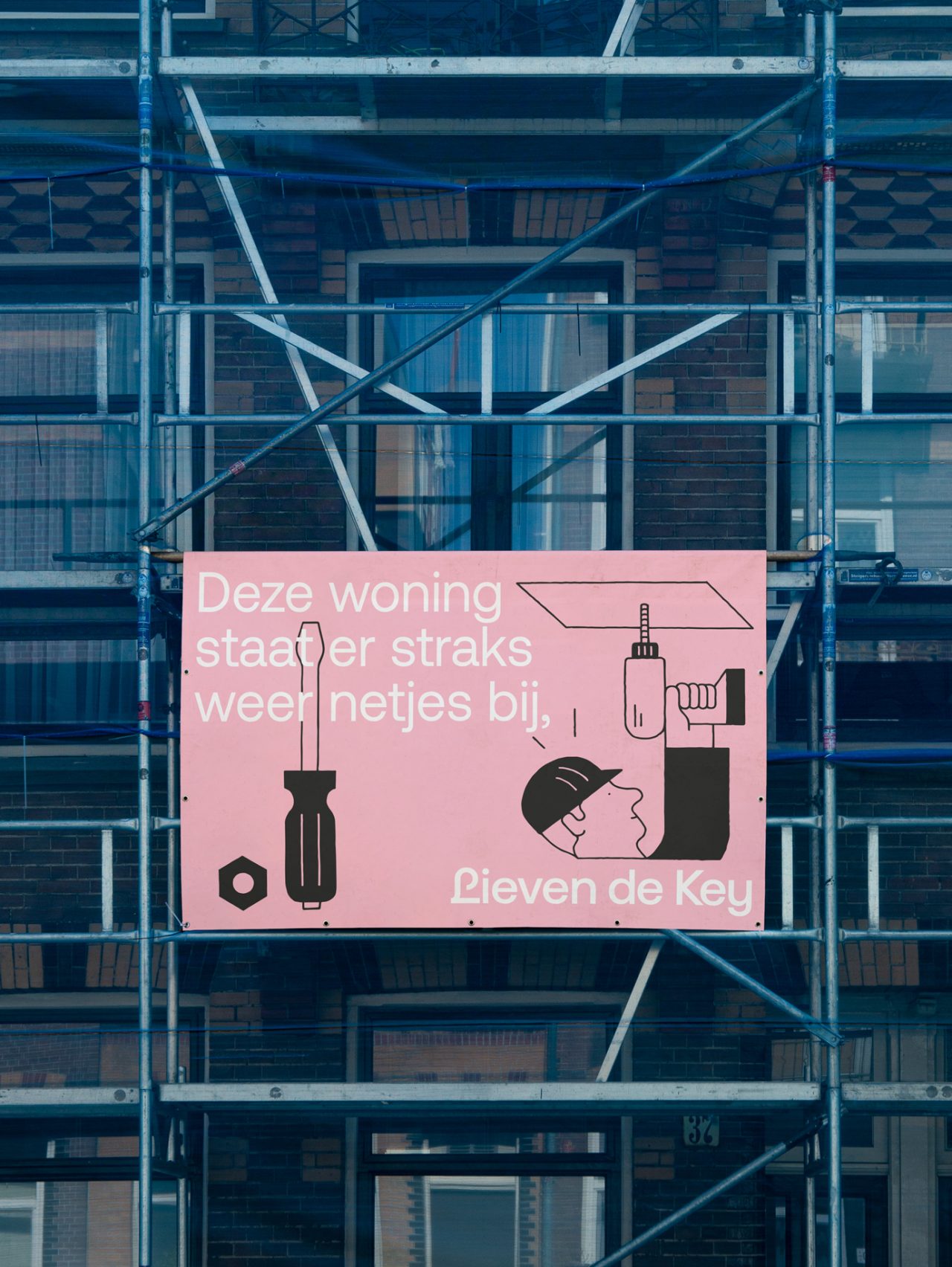
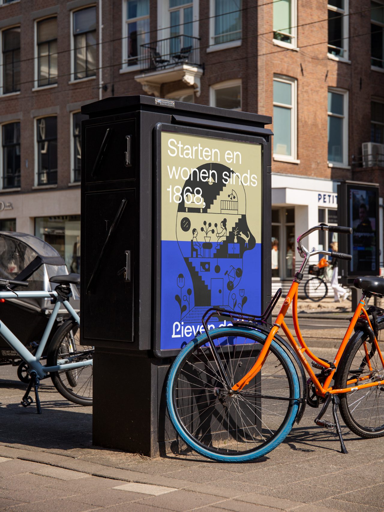
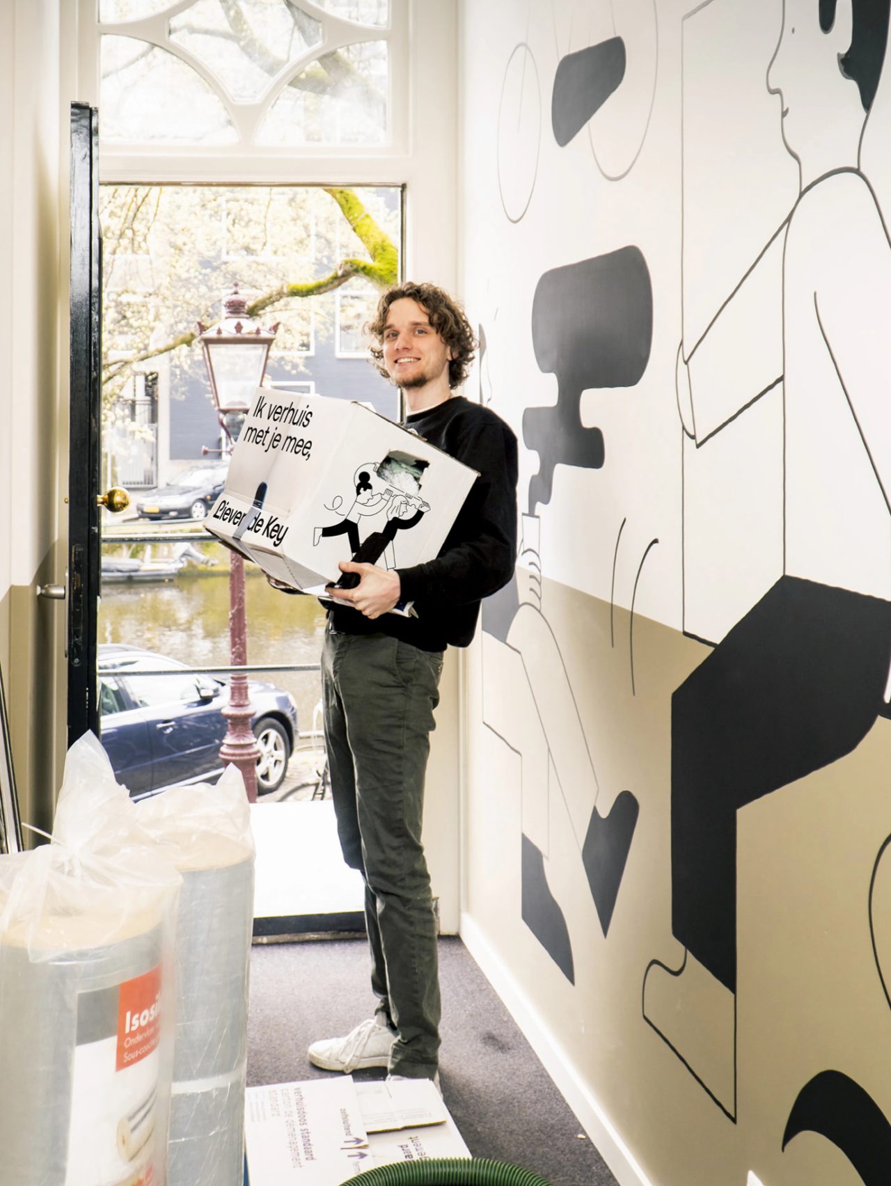
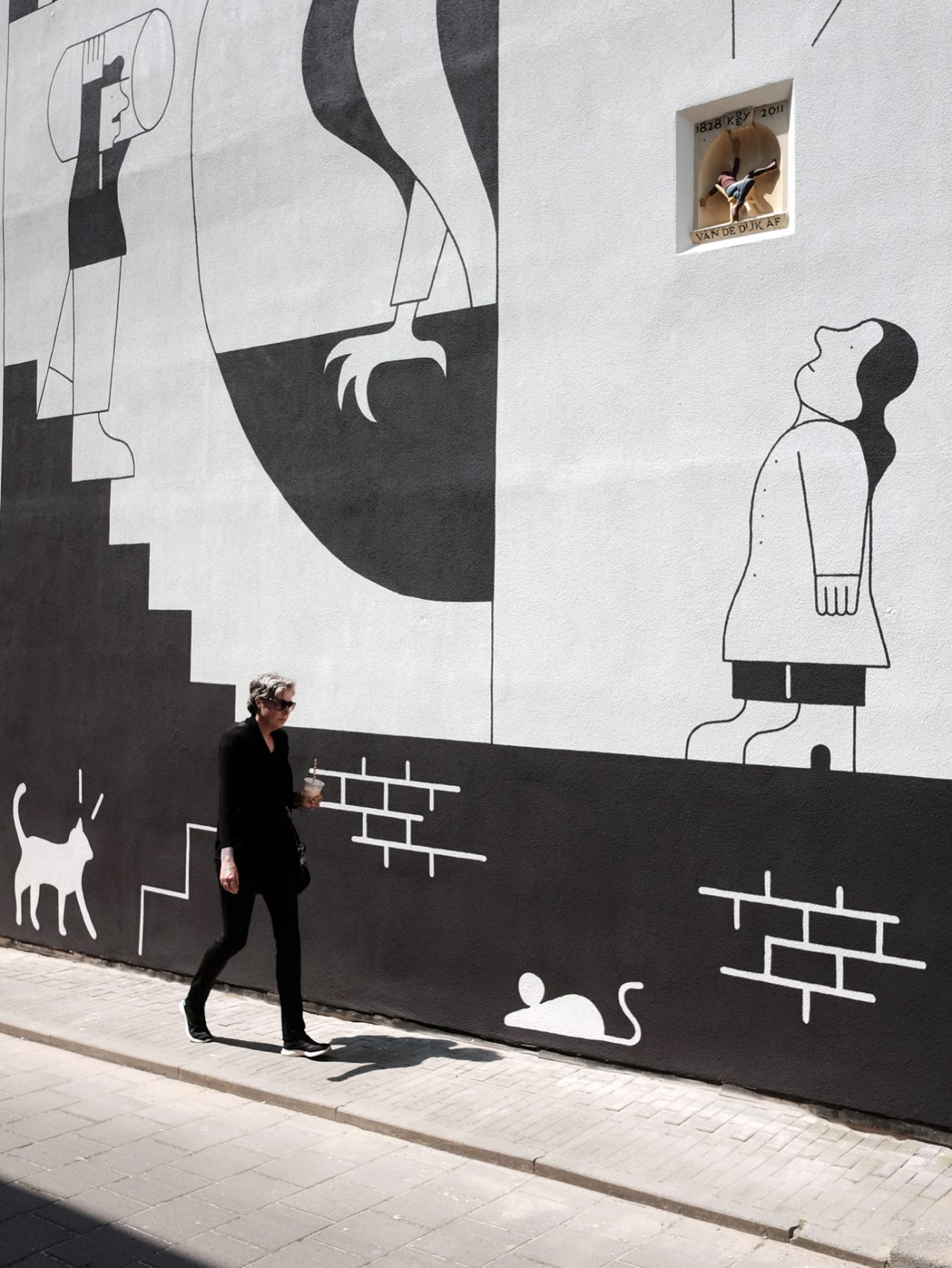
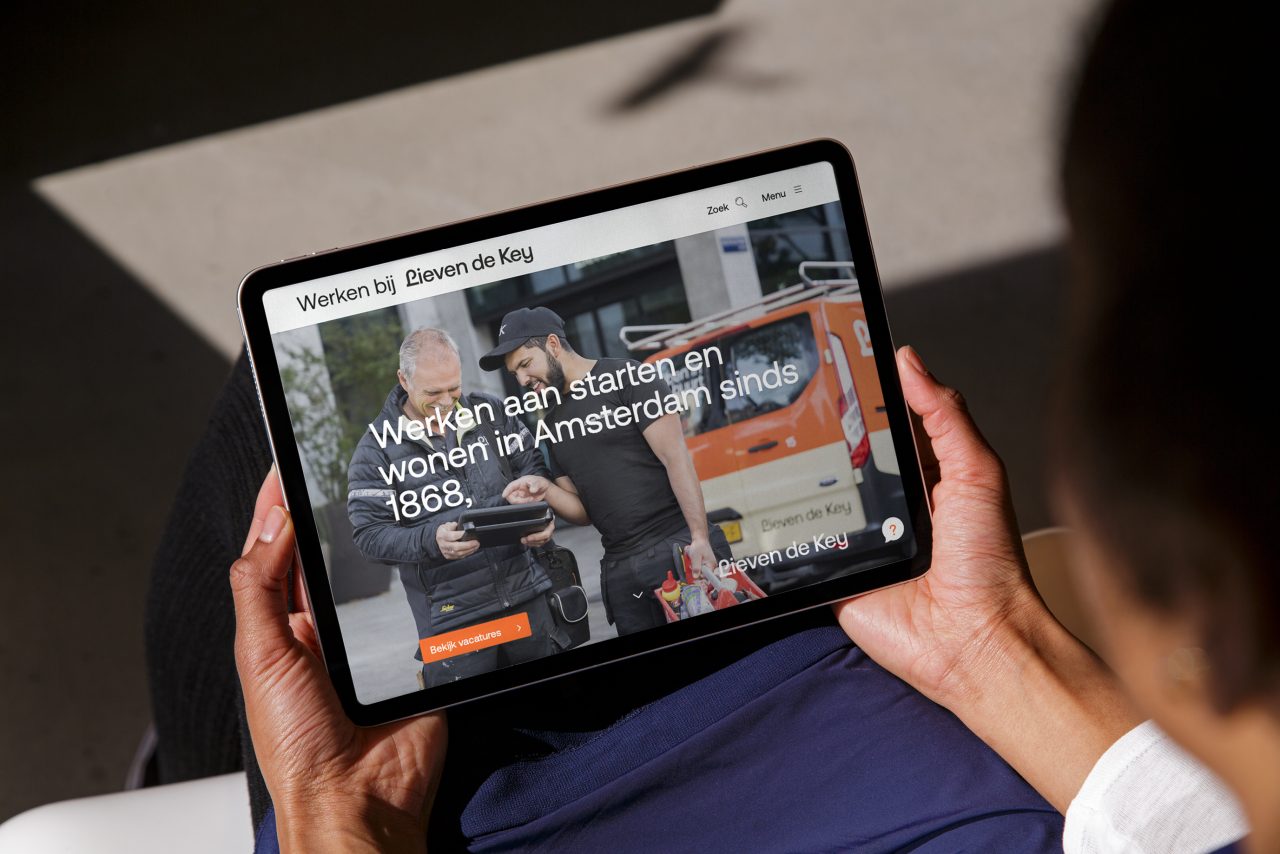
Lieven de Key is a housing association in Amsterdam with a rich history. The story began in 1868, when 500 workers decided to save a dime every week. Their mission? To create affordable housing and opportunities in a city that is always evolving. Lieven de Key remains true to its mission by supporting starters and residents in a dynamic city where everyone can begin, grow, and live together. This rich history, unique identity, and vision call for a look that fully reflects these values.
Our Challenge
Workshops and interviews revealed that tenants often perceived the organization as distant. Moreover, it was not always clear what Lieven de Key stood for. This required a fresh approach: a personal, accessible look and a visual identity that honors its rich history while looking ahead towards the future.
A Name with Meaning
Lieven de Key, a master builder who fled his homeland and found a fresh start in the Netherlands, aligns perfectly with the housing association’s mission: contributing to the city’s dynamism and offering young people opportunities to take their first steps on the housing market. Transitioning from “De Key” to “Lieven de Key” makes the name more personal and approachable without losing its strength. The slogan “Starting and Living Since 1868” encapsulates the organization’s essence, highlighting accessibility, affordability, and the creation of opportunities—values the organization upholds.
The New
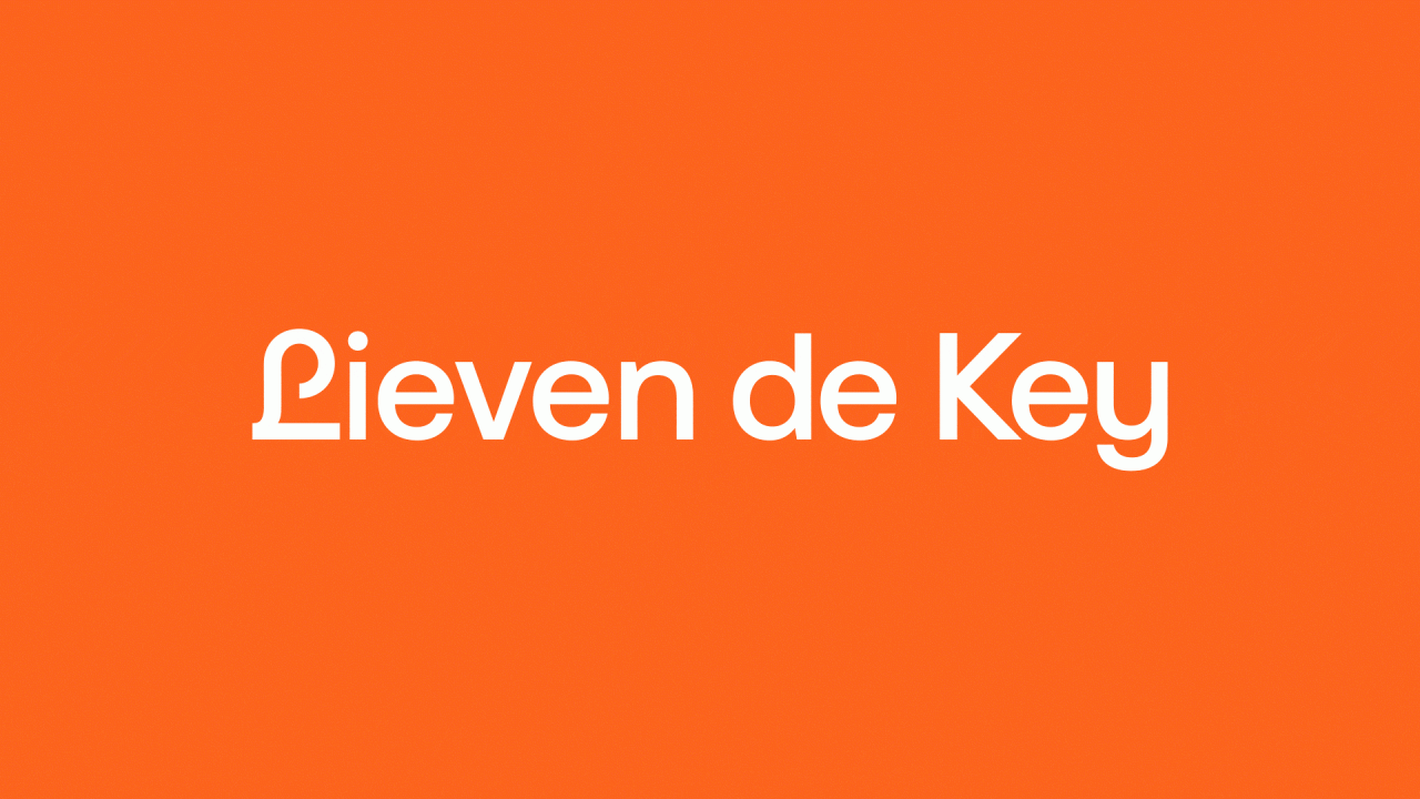
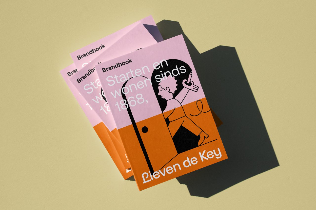
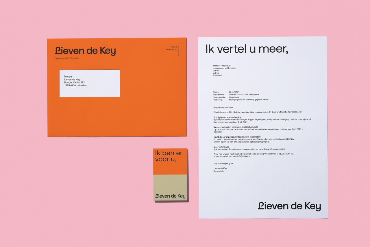
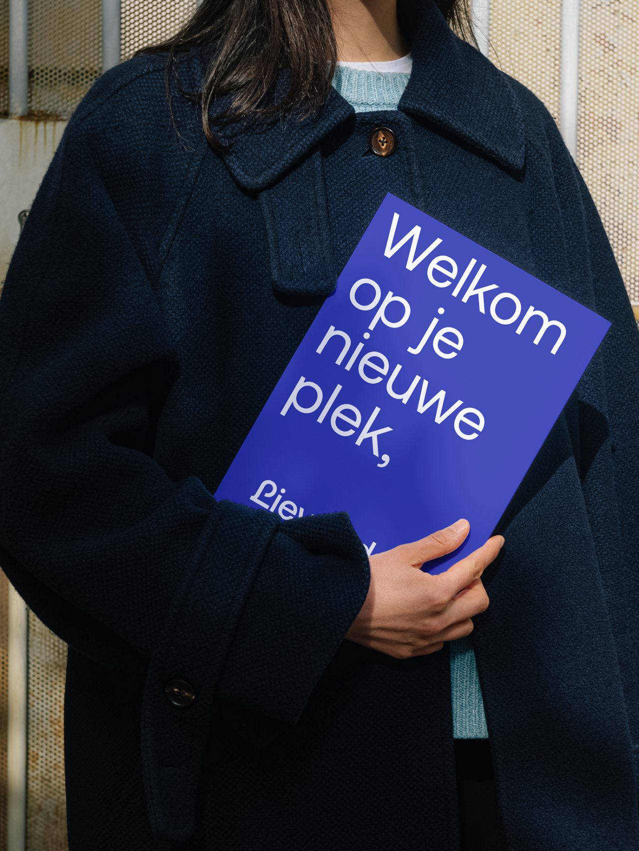
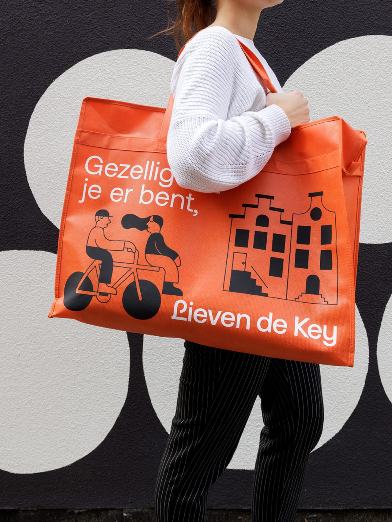
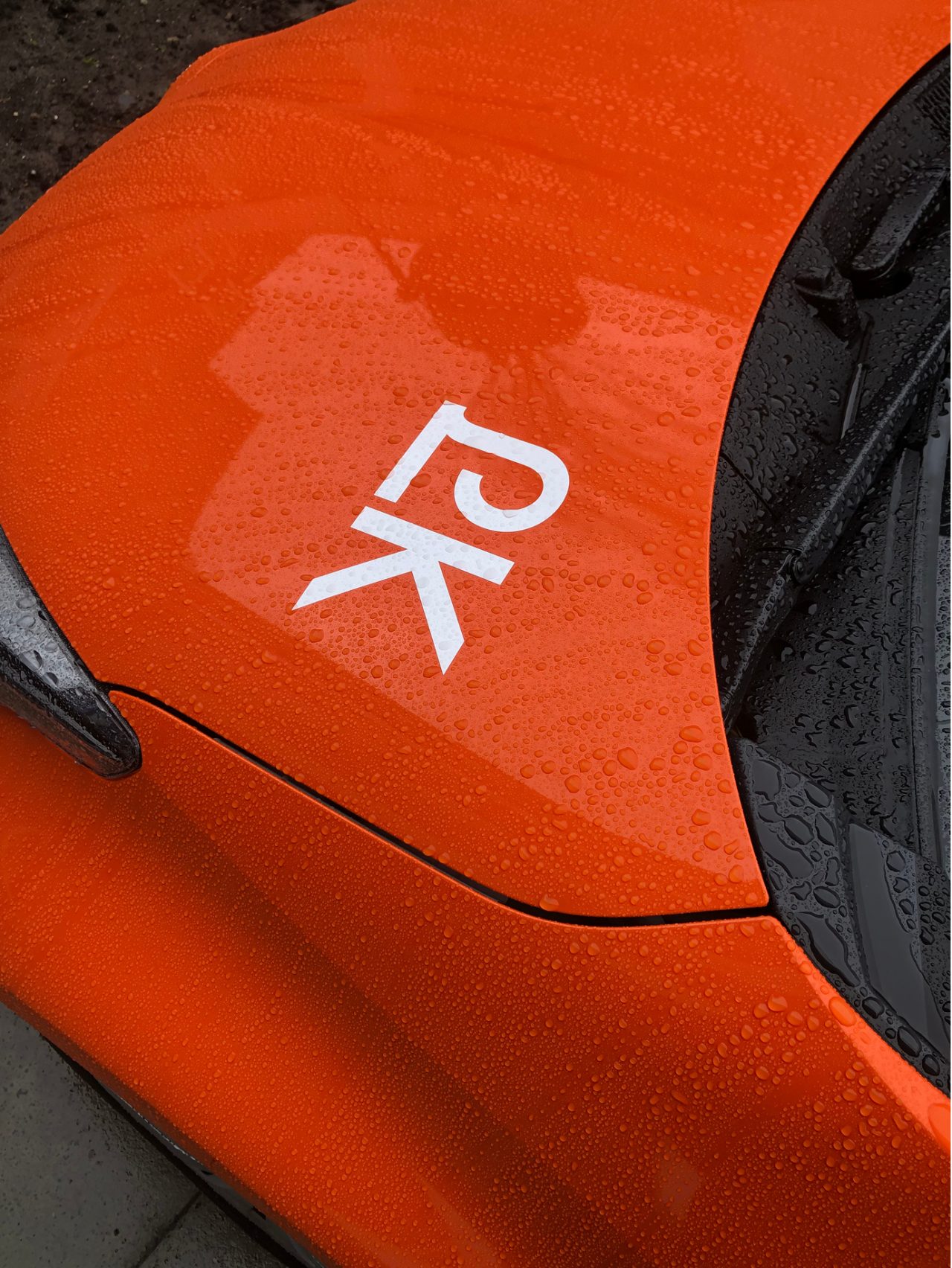
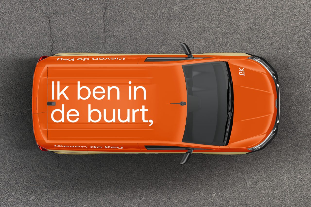
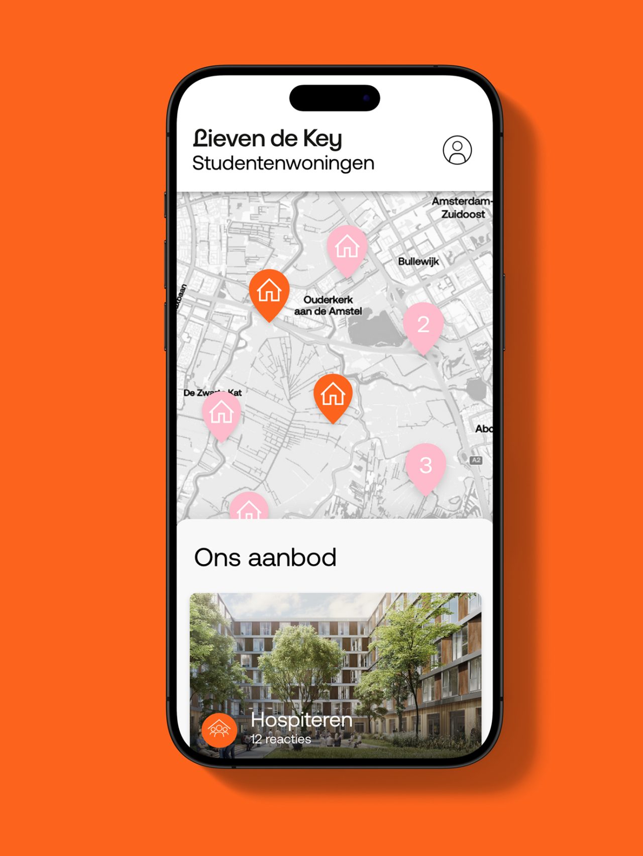
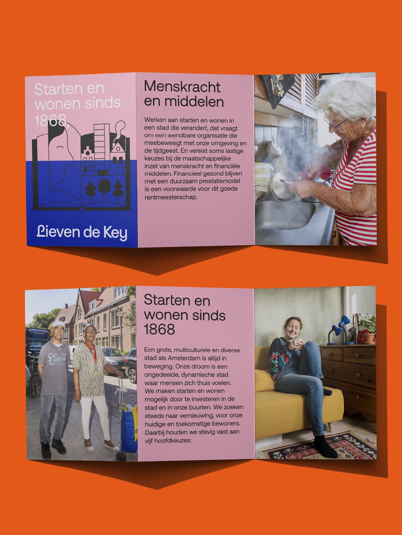
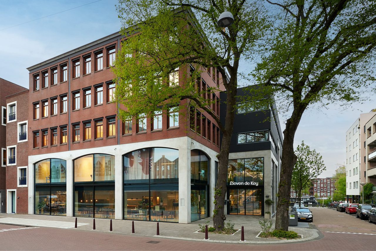
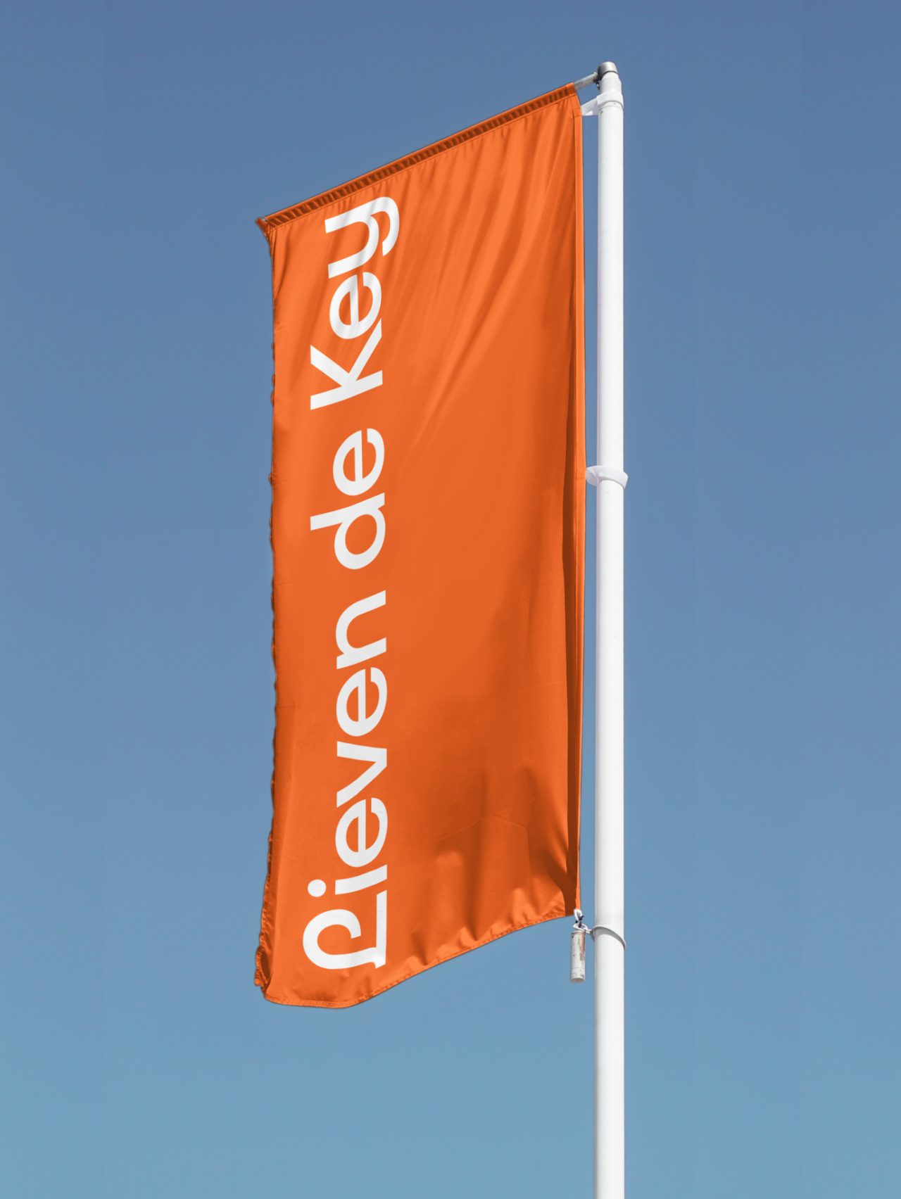
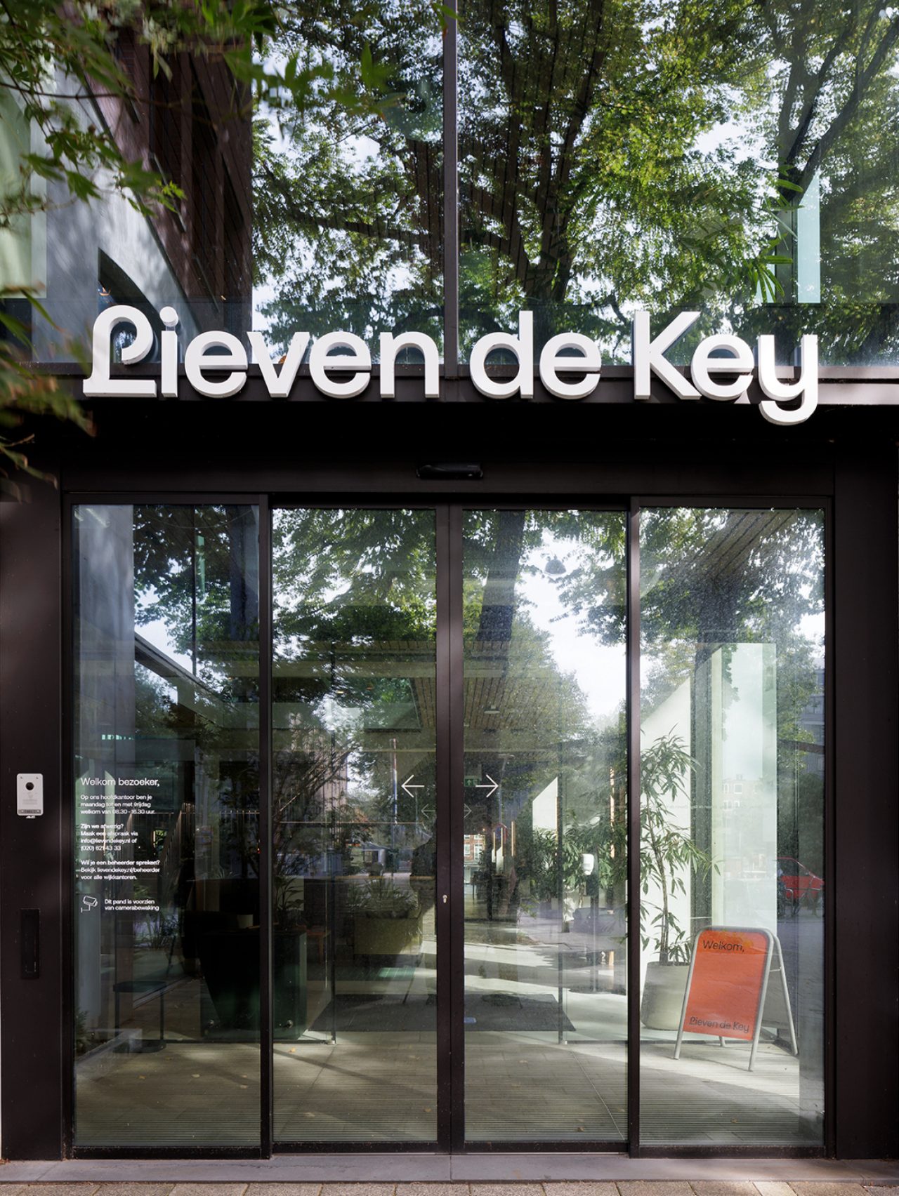
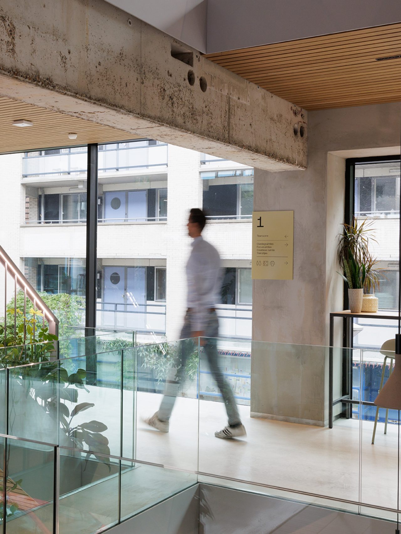
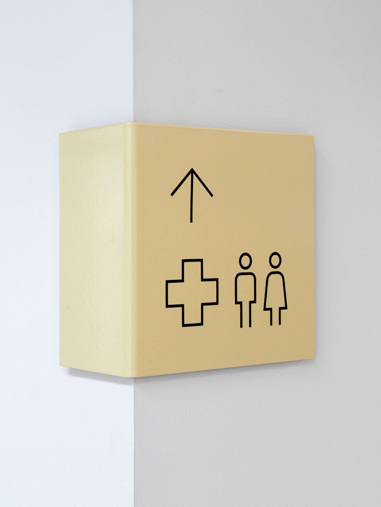
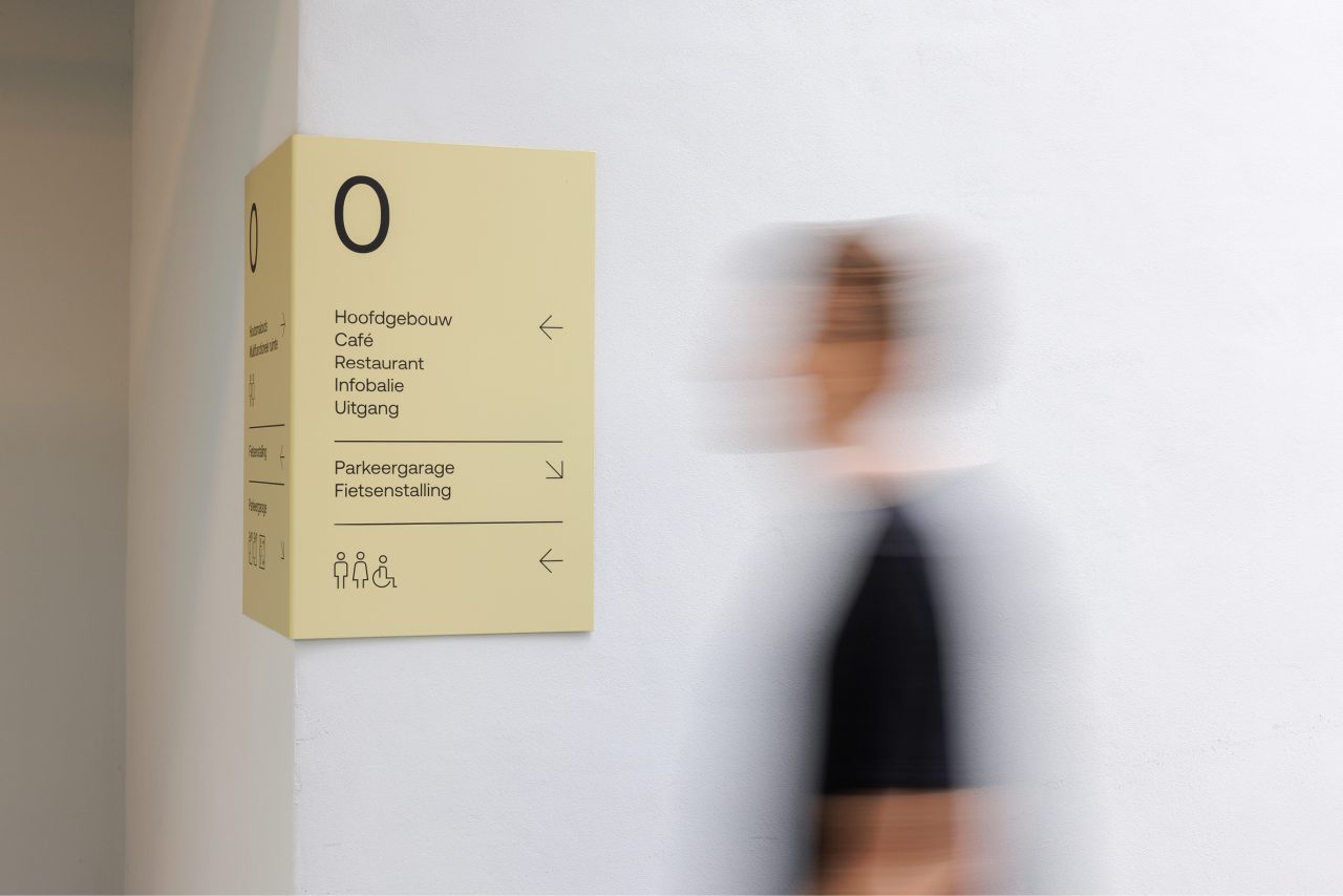
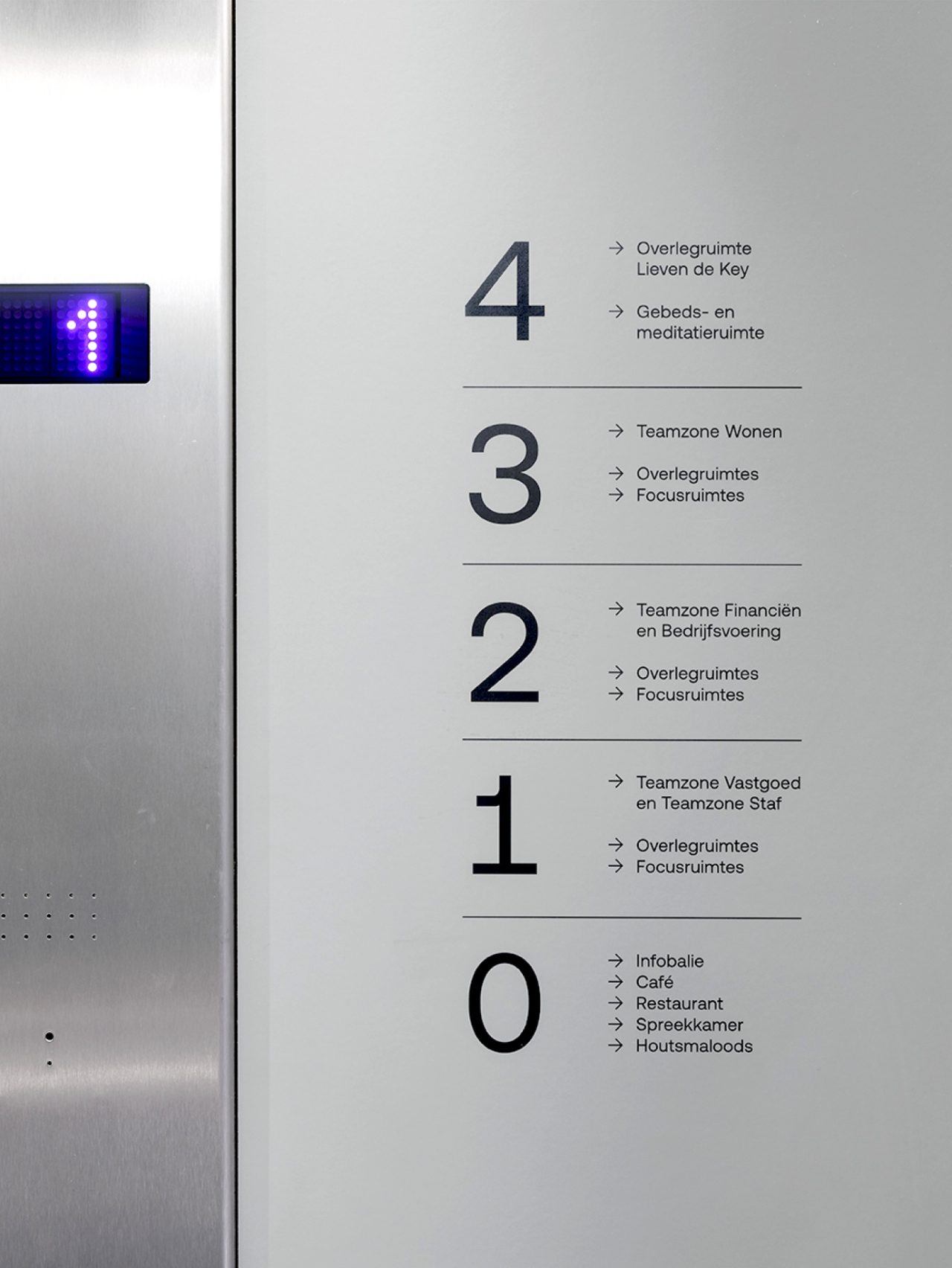
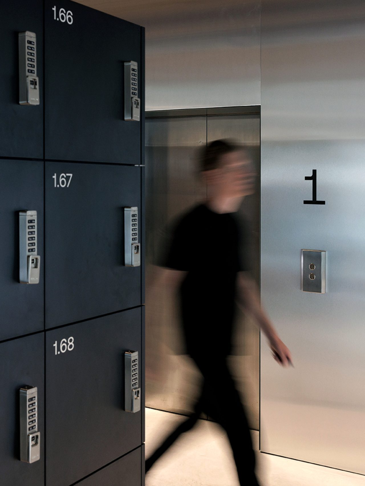
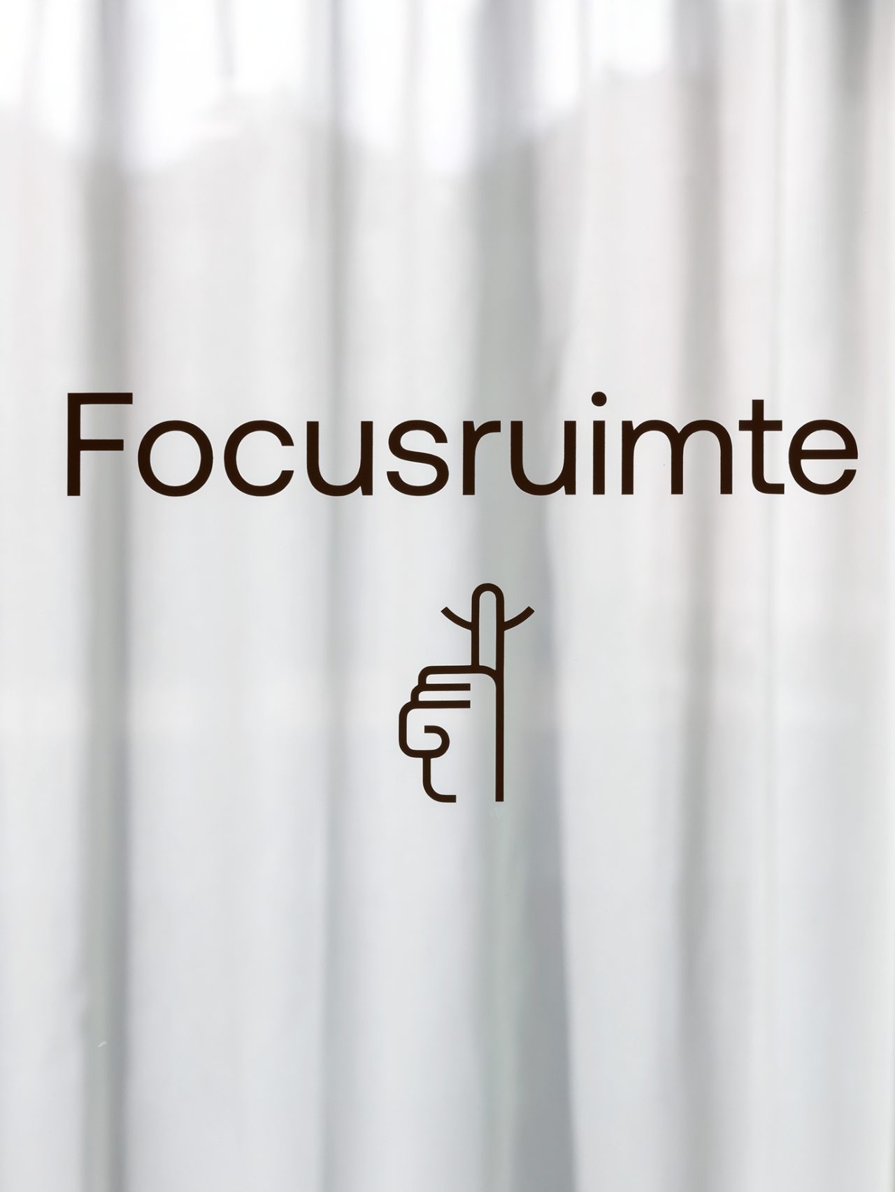
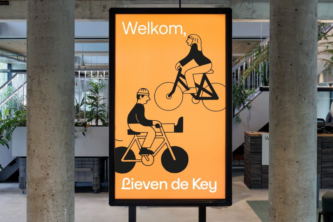
Look Using the historic “L” as the basis for the logo, we gave Lieven de Key’s heritage a contemporary twist. The shapes and lines draw inspiration from a classic letter L, while the modern typeface ensures a timeless and fresh look. The color palette, typography, and text, signed “Lieven de Key,” convey a sense of personality, warmth, and authenticity. Illustrations by Gino Bud Hoiting enhance the storytelling, making communication vibrant and relatable. The new style extends beyond a logo and colors. From printed materials and digital platforms to architecture, every aspect reflects the renewed identity. The brand manual equips staff with the tools to apply this style consistently across communication channels, from digital media to signage in offices and new apartments for young people.
The Result
The updated identity feels warm, familiar, and accessible. The strengthened image fosters greater engagement among tenants and staff. Lieven de Key once again radiates what it stands for: contributing to the vibrancy of Amsterdam. Through this transformation, Lieven de Key tells a timeless story that continues to grow—just like the city itself.
