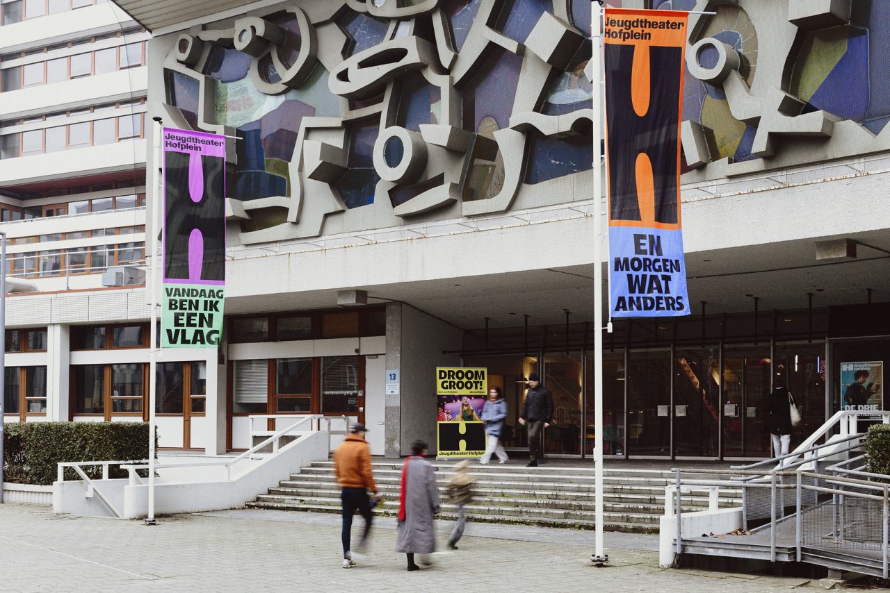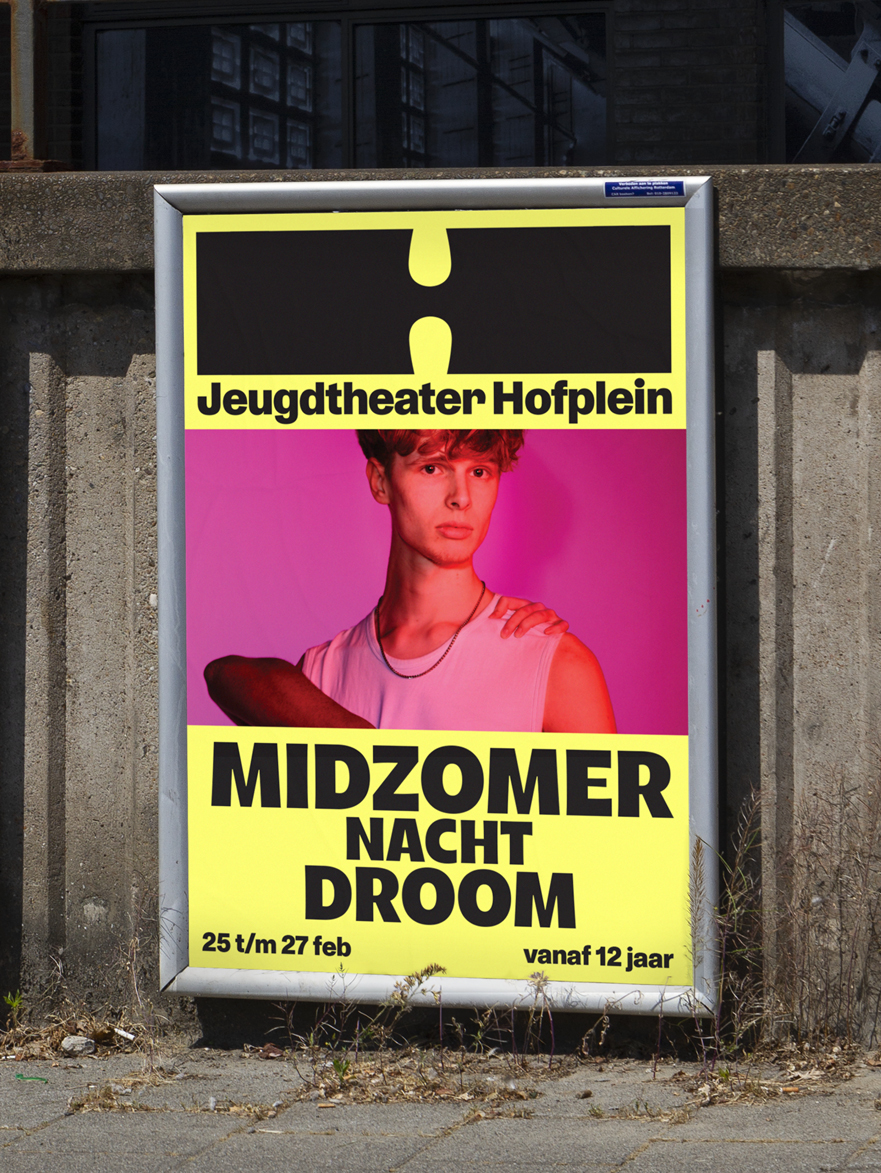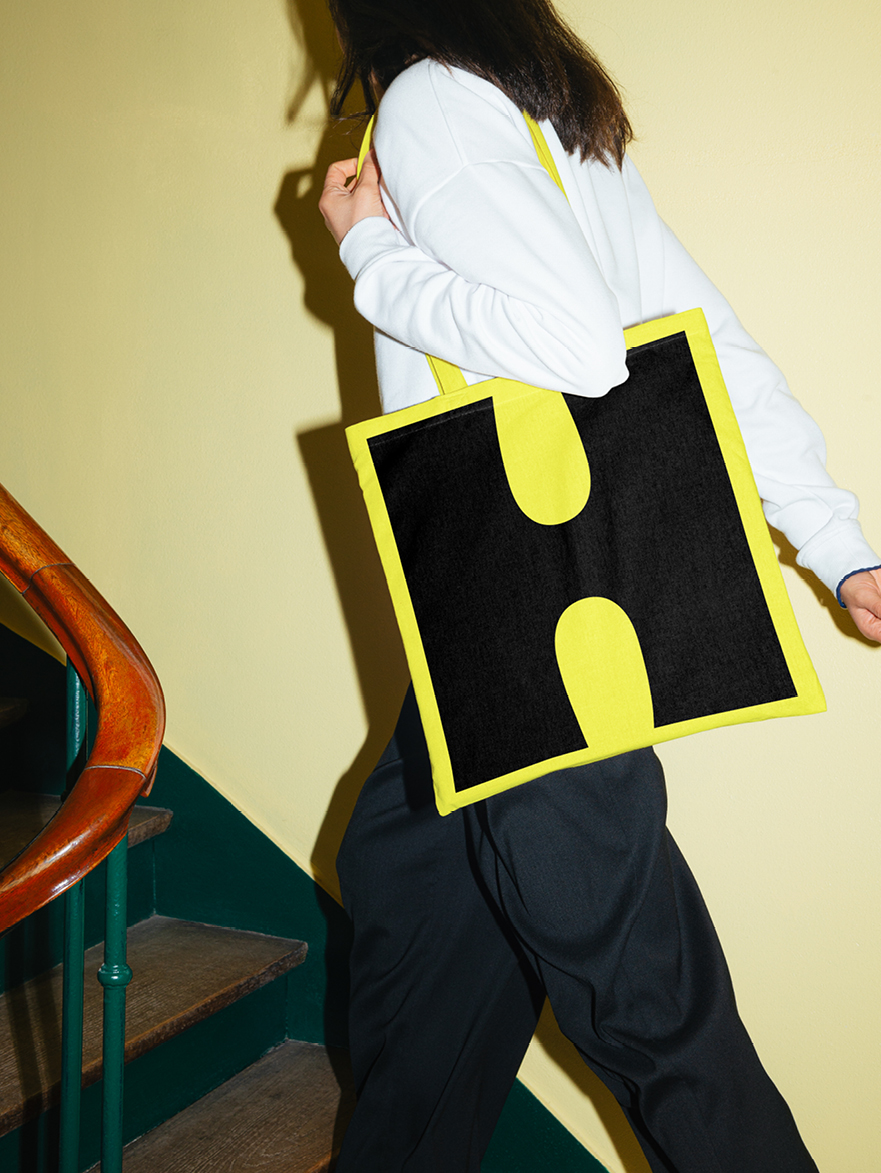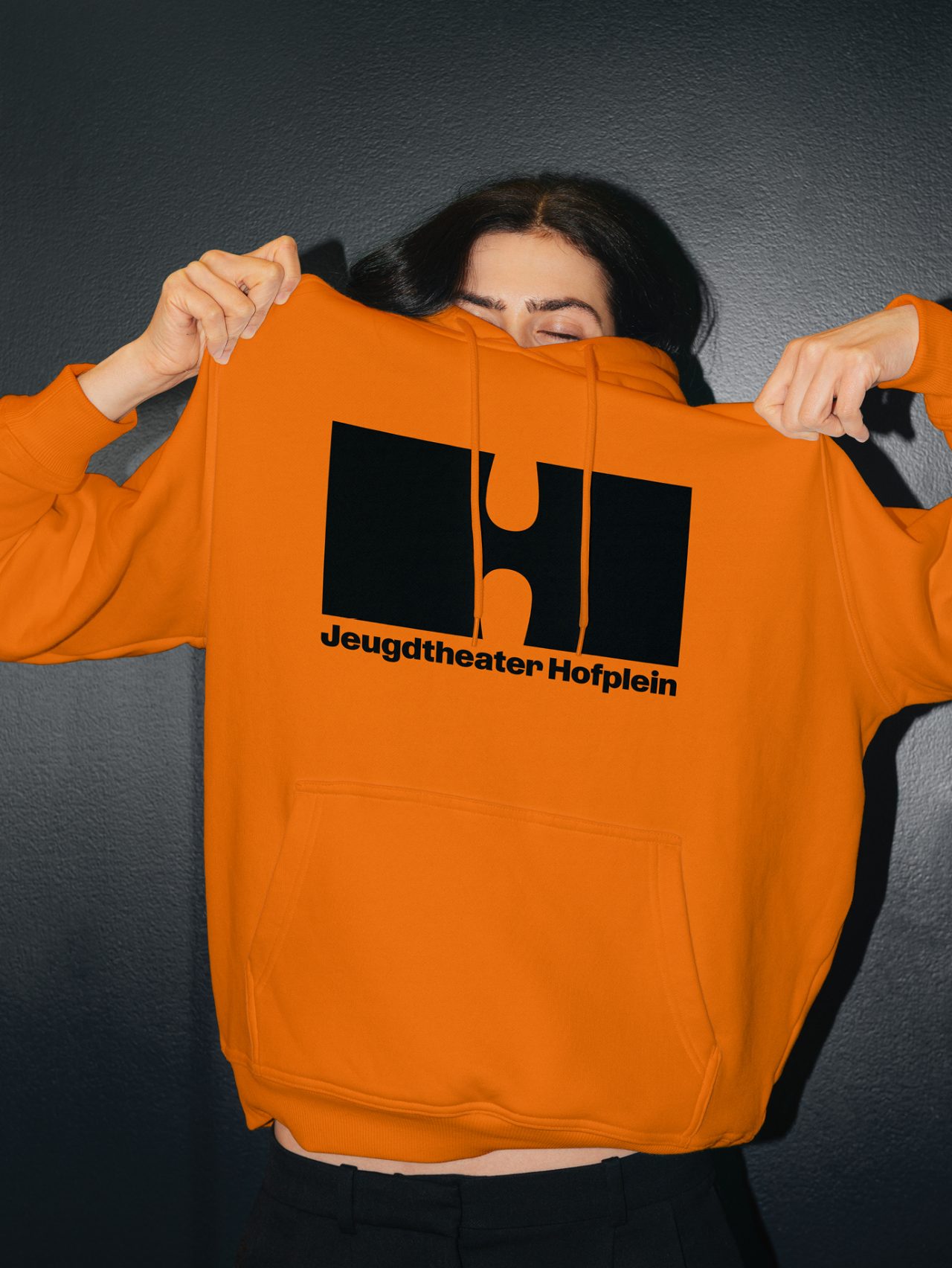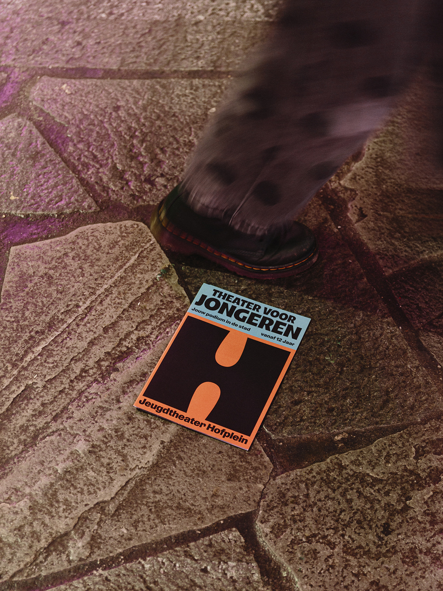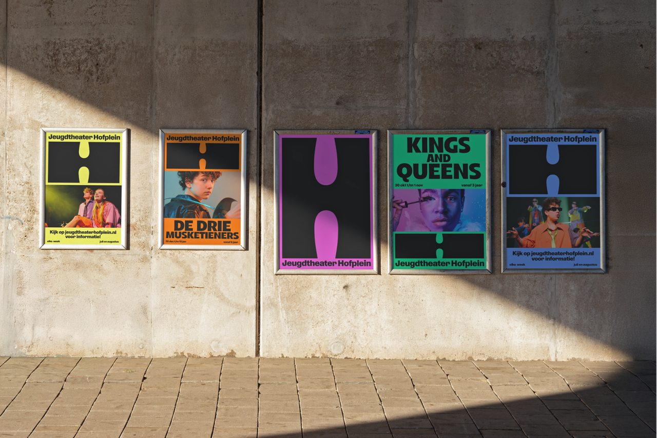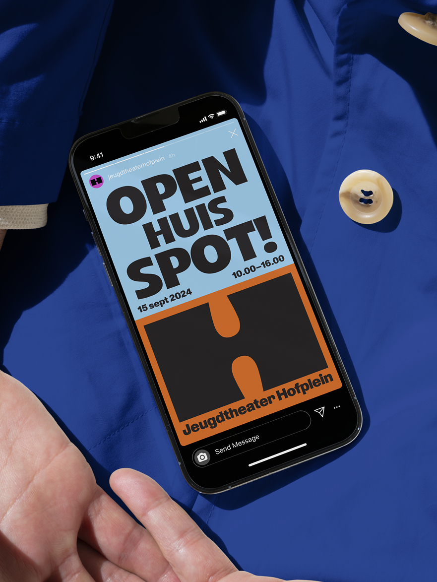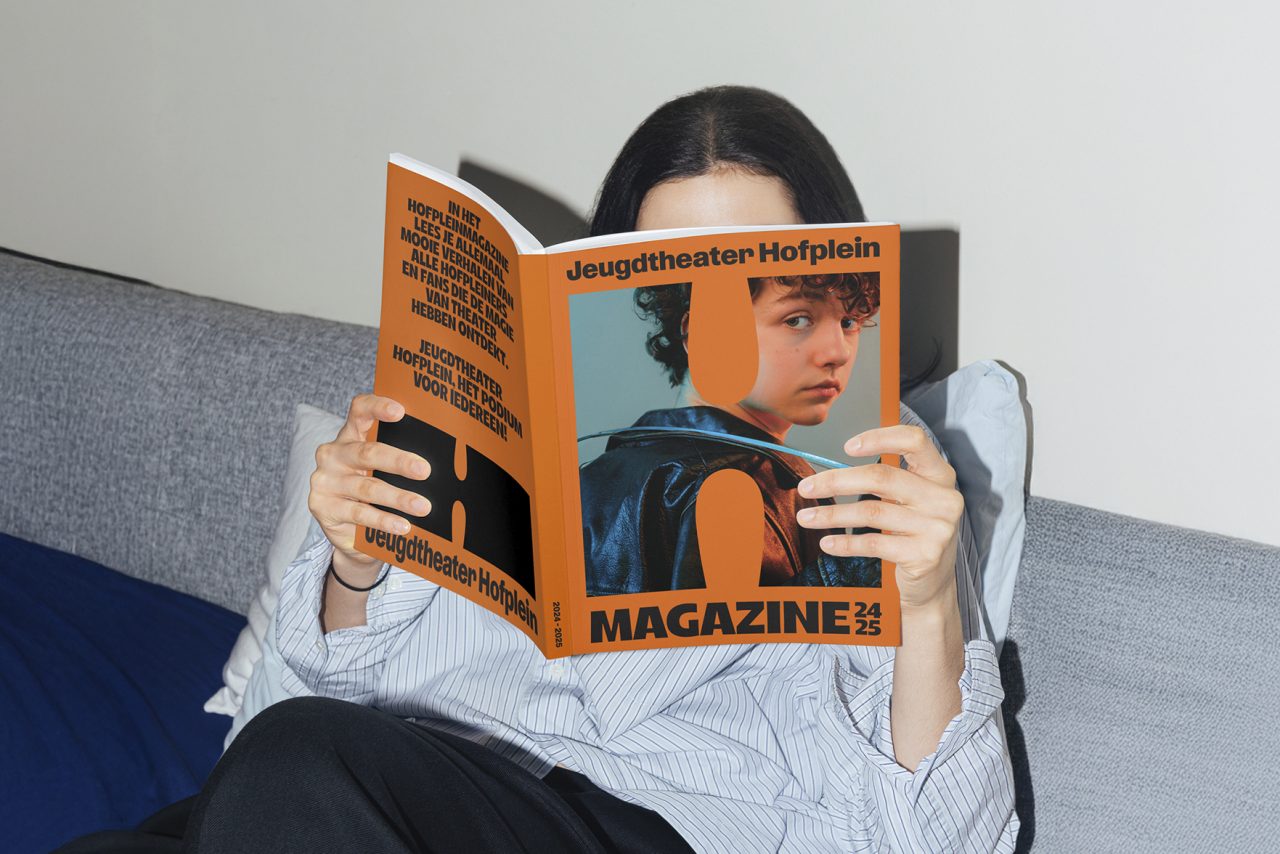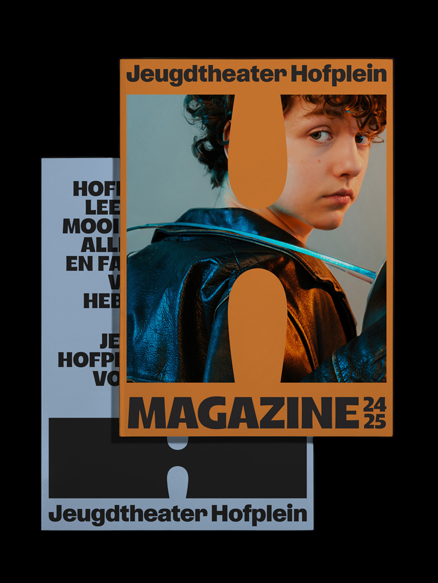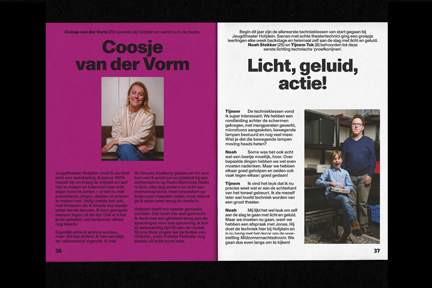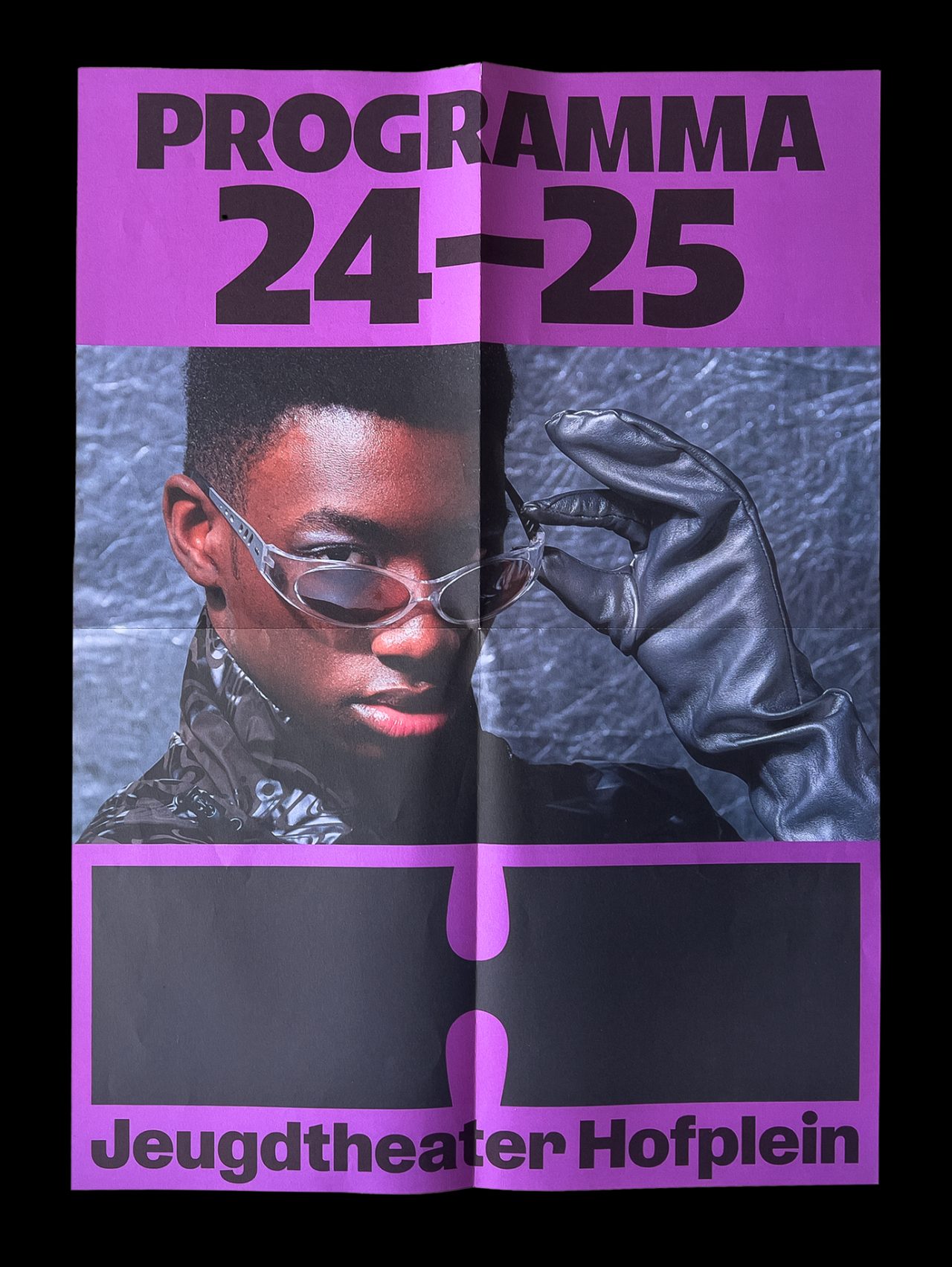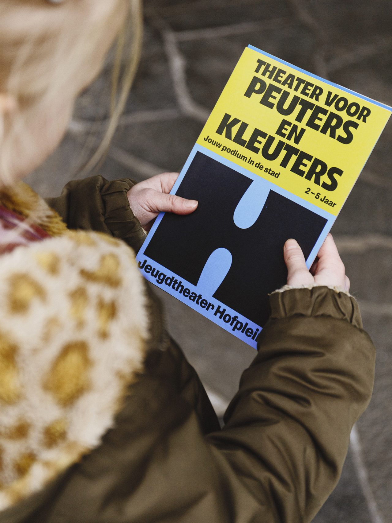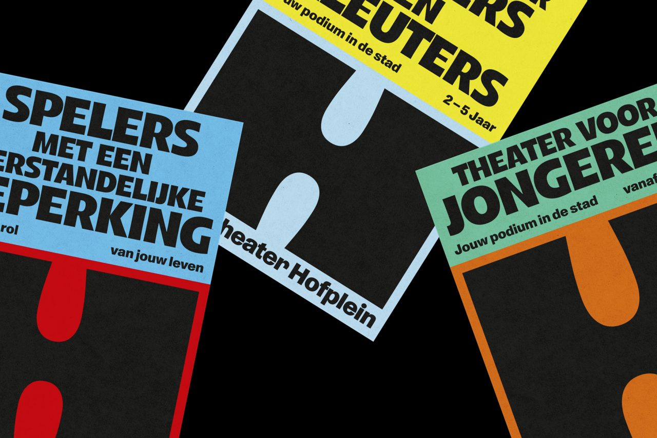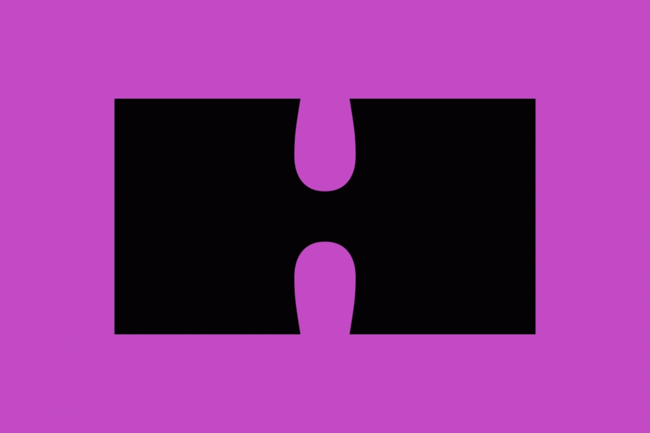
We rebranded Jeugdtheater Hofplein with a bold identity. Starring: a dynamic ‘H’—flexible and ever-changing—to reflect the theatre’s diverse, playful spirit and ensure its vision shines in every story.
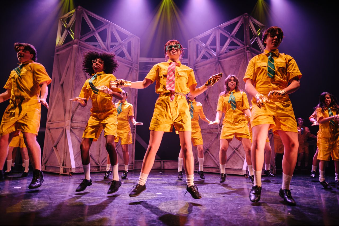
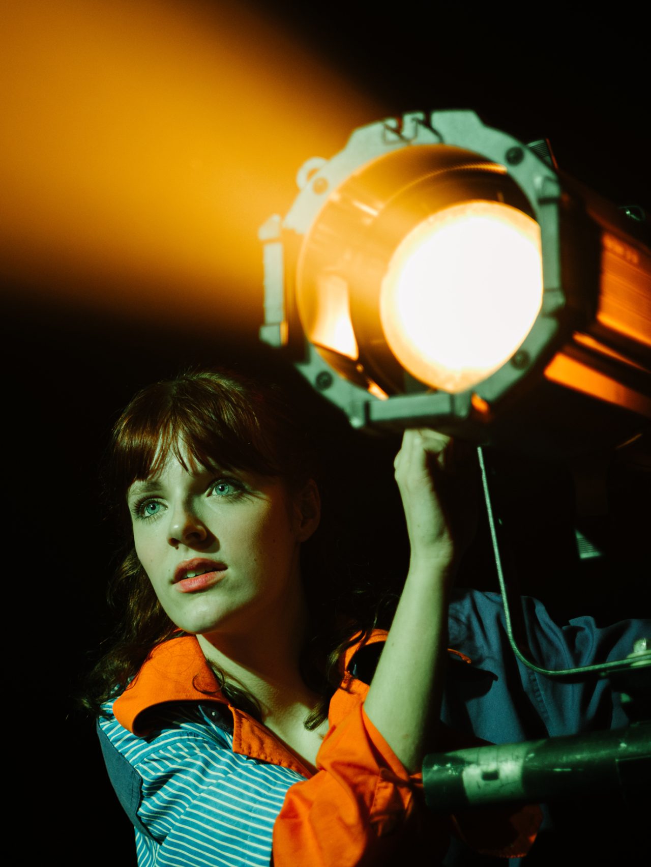
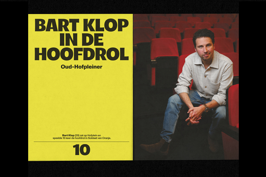
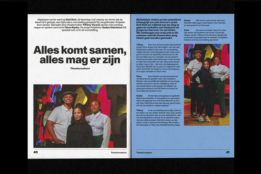
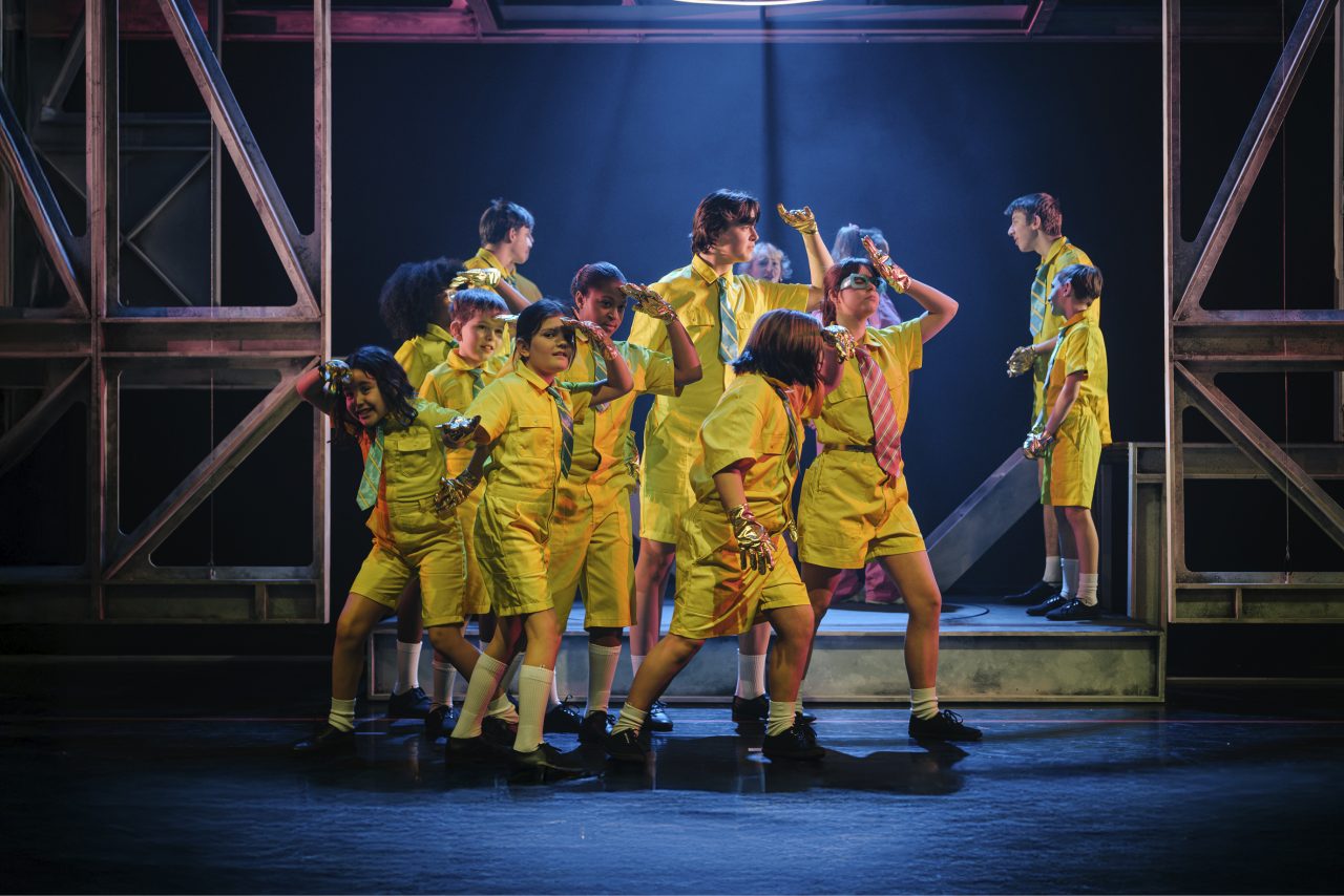
Jeugdtheater Hofplein has been a household name in Rotterdam and a home to over 100,000 young theater-makers and enthusiasts for nearly 40 years. Today, 11,500 children attend Jeugdtheater Hofplein yearly, participating in courses, workshops and performances. Hofplein has always dared to be different—bold, contemporary, and ever-evolving. With their fresh perspective on youth theater – they needed a new look to match. But how do you express such a vibrant community in a visual identity? Our concept was to create an identity as dynamic and playful as the Hofplein community itself.
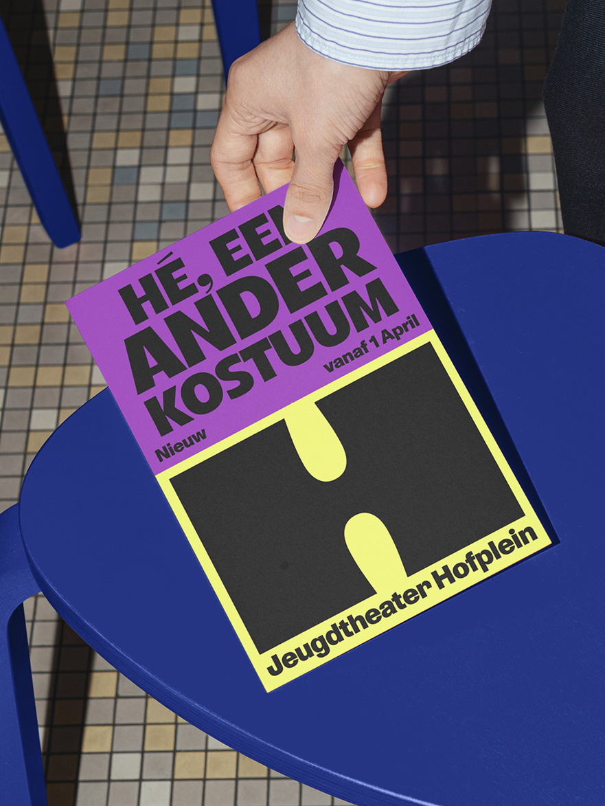
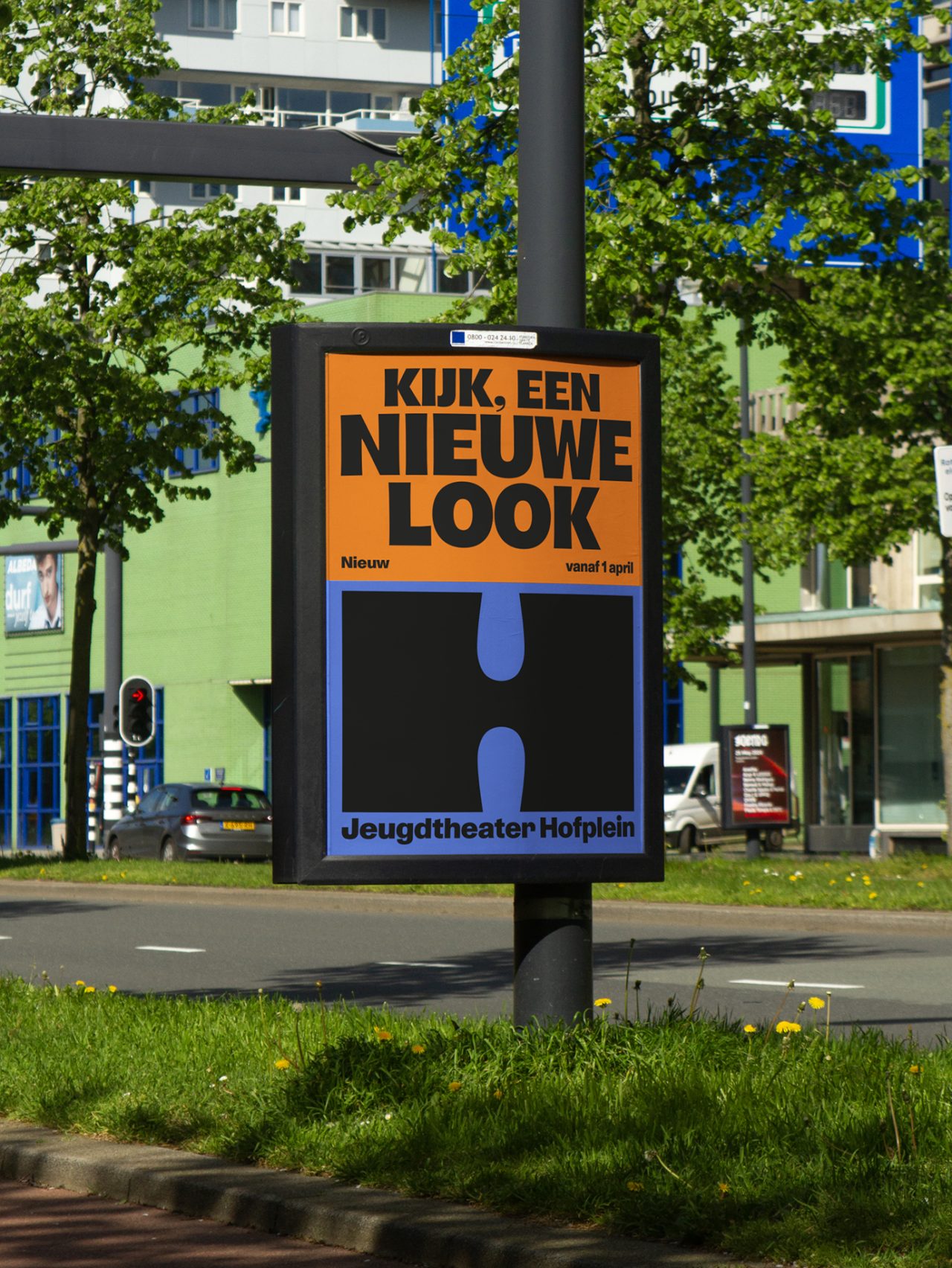
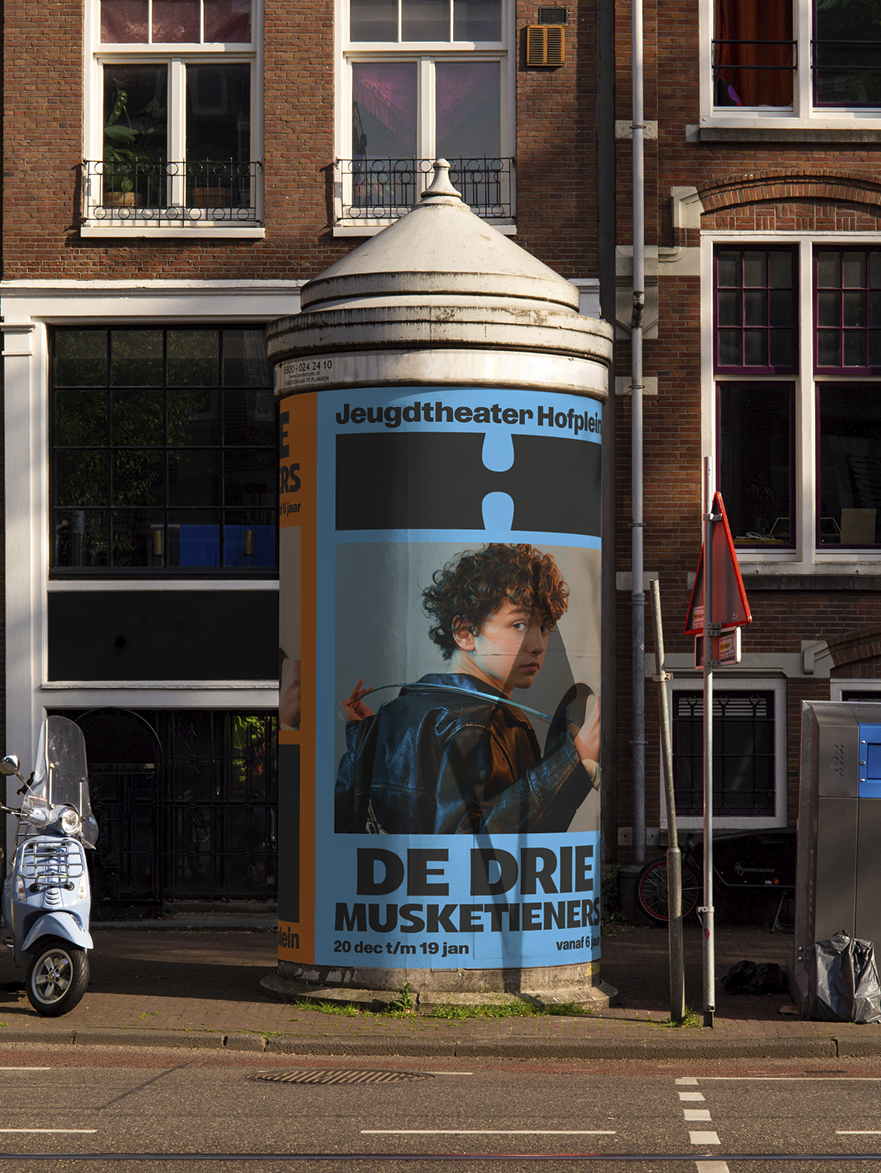
At the heart of the new identity is the flexible, ever-changing ‘H’. This symbol transforms and moves, just like the players on stage, adapting to every story, scene and stage. The ‘H’ is not a static logo, but a living element that shapes itself to the context – symbolizing the creativity and vision at the heart of Hofplein.
We also introduced a powerful color palette of primary colours, which, together with the deep black, form a powerful contrast. This symbolizes Hofplein’s energy and diversity: the colors bring playfulness and expression, while black provides depth and focus.
The result is an identity that is both recognisable and flexible, positioning Hofplein as a theater that not only tells stories, but also offers space for stories to be discovered and experienced.