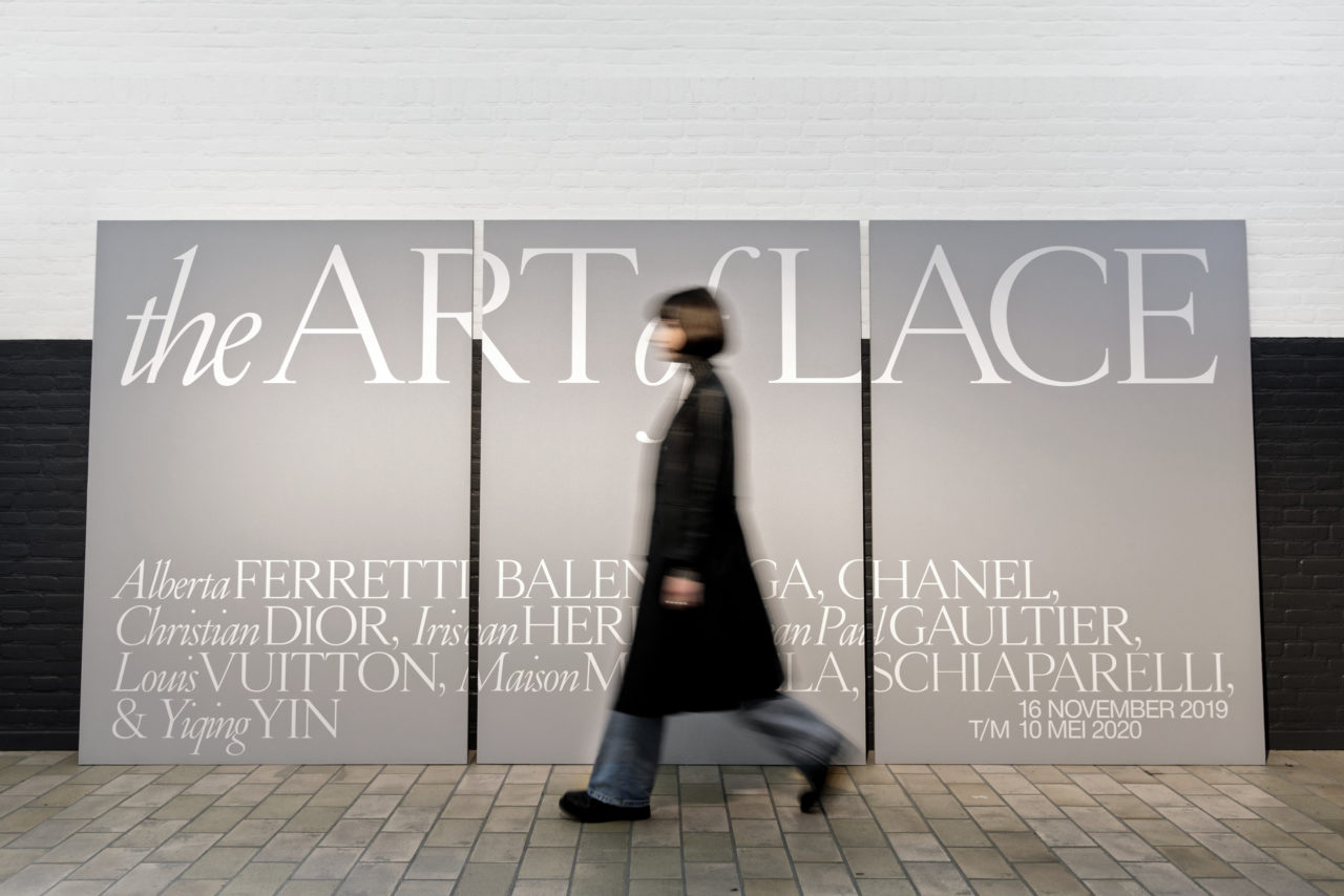
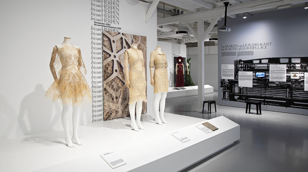
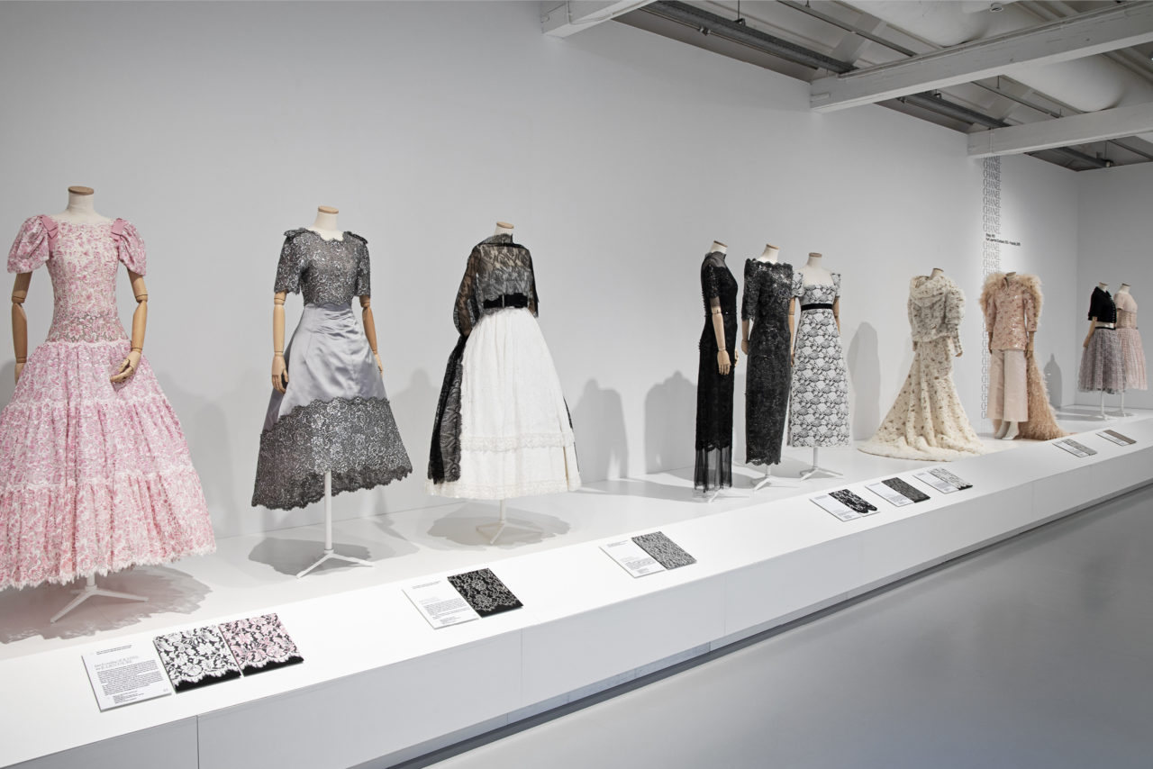
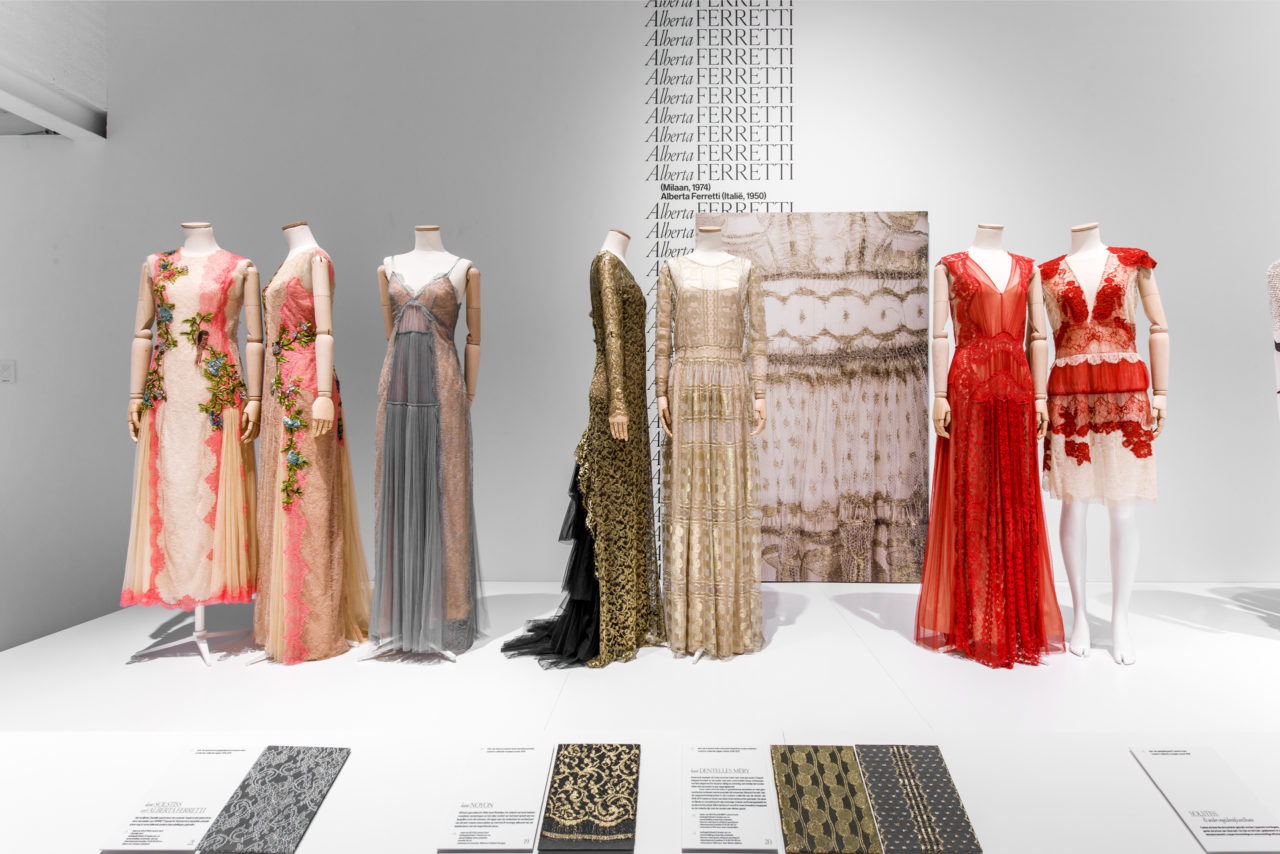
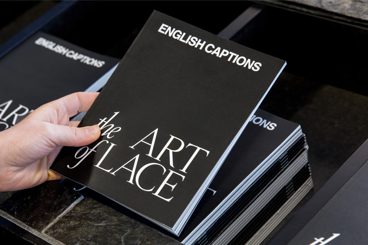
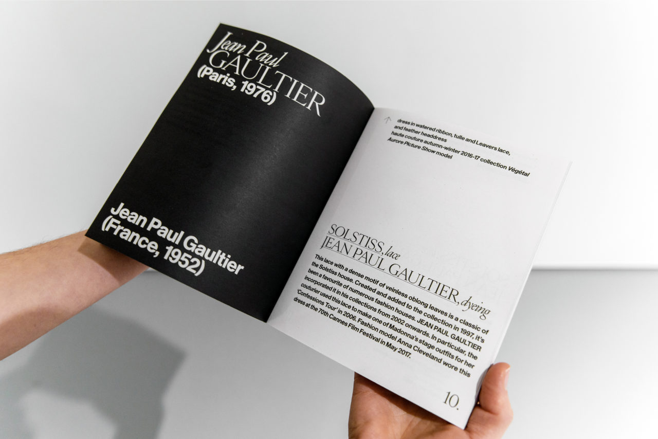
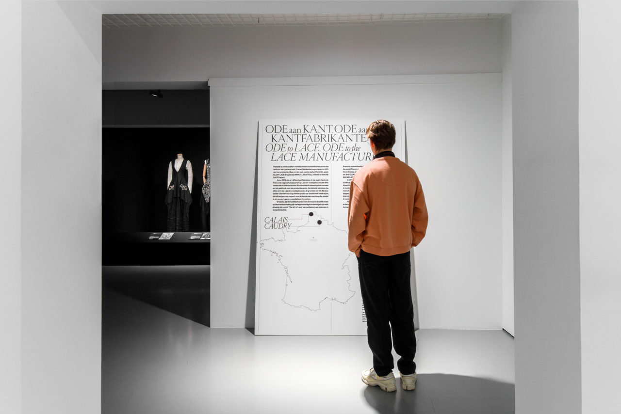
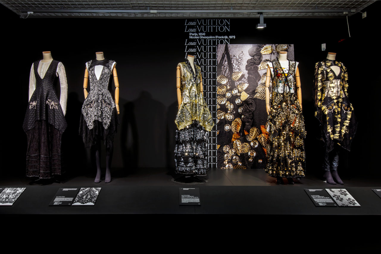
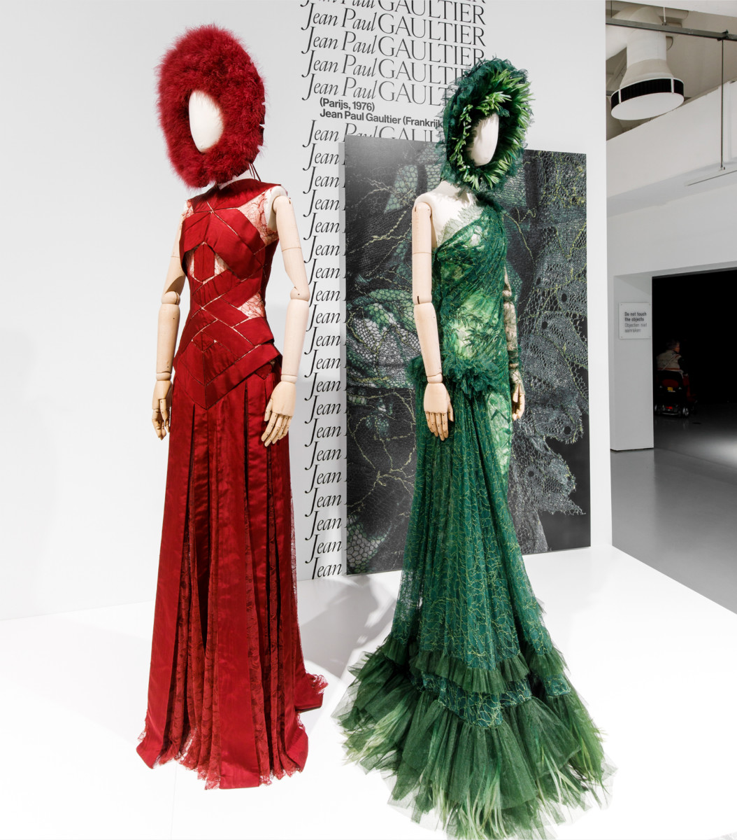
The exhibition The Art of Lace in TextielMuseum Tilburg presents an impressive overview of haute couture made with a classic fabric that is having a revival: lace. Countless creations from renowned fashion designers such as Chanel and Maison Margiela are on show. For the exhibition design we developed the concept Typographical Lace, in which we treated graphic design as if it were haute couture.
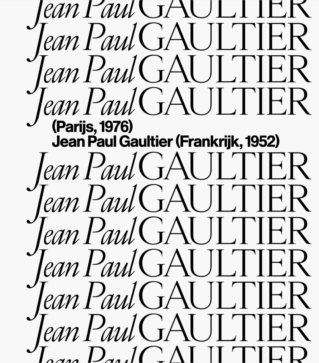
Typographic Lace
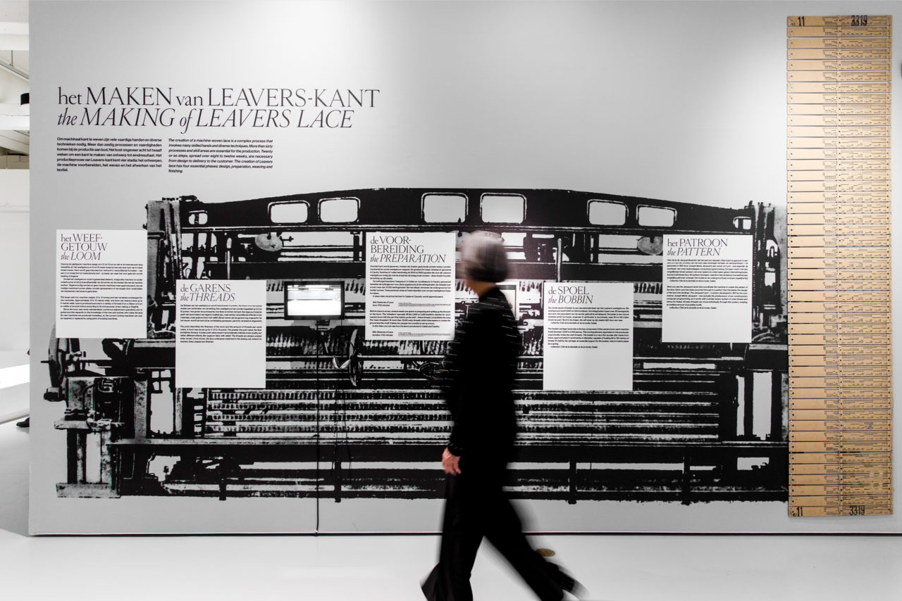
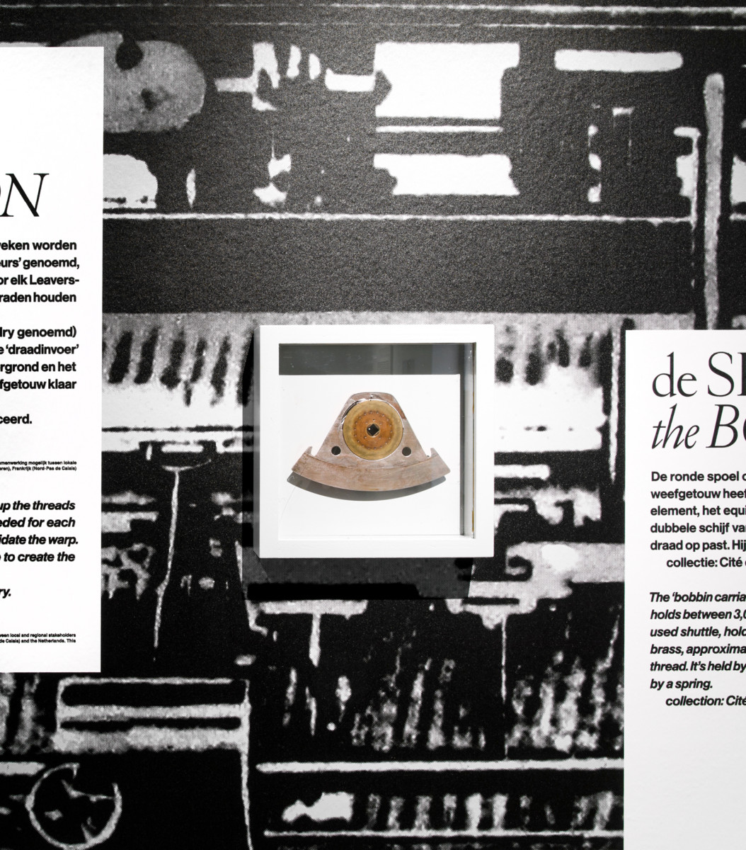
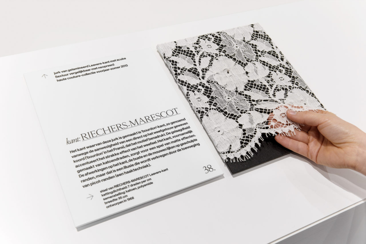
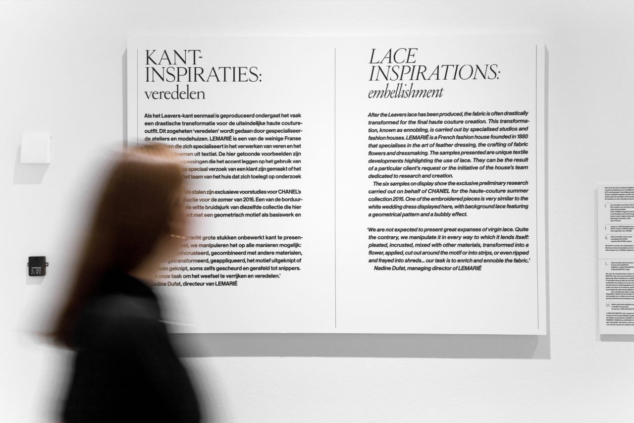
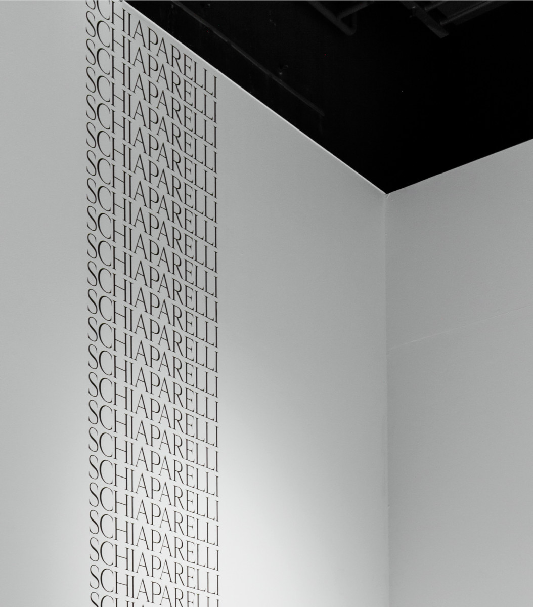
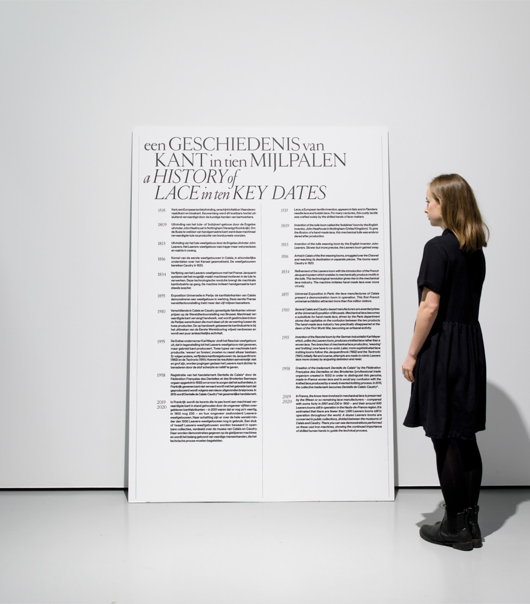
For our exhibition design, we were inspired by the unique shapes and patterns of lace, which reminded us of the iconic typography of classic French fashion magazines such as Vogue. Their graceful serif letter, close spacing and repetition return as a structure in the exhibition’s design and lettering. Our design enhances the unique experience of lace throughout the exhibition. This way, the gorgeous haute couture pieces on display are emphasised.
Intensify the experience
The desired effect works out wonderfully. While our designs and typography are outspoken, they are not dominant in the context of the exhibition. We make a bold statement that doesn’t overshadow the presented pieces. Instead, our work blends into the exhibition in order to intensify the overall experience of lace.
